Showing posts with label Comic/Cartoon. Show all posts

Monday, October 1, 2012

Baby Steps (Let's Get this Mini-Comic Started)

A couple of weeks ago I had the pleasure of seeing Gilbert and Jaime Hernandez at The Free Library of Philadelphia. It was a great event. Los Bros Hernandez hadn't been to the Free Library since the early 90's and I had never seen or heard them speak before. They are legends in the comic world, and I wanted to hear what they had to say.

 What I loved most was that they didn't actually say all too much, and they explained why. As they clicked through a power point presentation up on the projector screen, they talked about where they were in their careers, what had happened to them in real life, what was happening to the characters in Love and Rockets. They explained their journey, but they pretty much reject the idea of any in-depth critique or examination of their work. They are the first to admit that a lot of their work came from an idea of "I want to see these two characters together. I want to see what happens" (I am paraphrasing despite my use of quotation marks). The trained literary critic inside me wanted to yell, "Bullshit! You must have had some message, some argument, some meaning in mind!" But to be honest, I myself often write and draw not knowing what will happen in the end. It is sometimes better to trust the dark side of the moon of your brain. Let your subconscious do some work instead. Anyway, it was a pretty awesome presentation if only because the messages I took from it were "MAKE COMICS!" and "TELL STORIES!" and "FOCUS ON CHARACTERS!"

Afterwards, when Gilbert and Jaime were signing books, I specifically asked what kind of pencils, brushes, and inks they used. Jaime does not use a non-photo pencil or a brush, which surprised me. He is a nib man. And graphite --> ink. And both Hernandez Hermanos use Speedball brand Super Black ink. So, I wanted to make a 2-3 page comics about what happened that night, what I remember, and what I walked away with. My comic art process in this post is the first step to making that mini-comic. It is kind of a dry run, kind of a preview, kind of practice just to keep sketching, keep inking, keep scanning as much as I can.
simple pencil sketch.
Used a G nib and Speedball super black ink.
Added some shading using cool grey Prismacolor markers.
Colorized the grayscale image and added some halftone shading using Paint Shop Pro.
Finally added some narrative text using a box as well as text directly into the image.
So, I do plan on expanding this out to a 2-3 page comic, so stay tuned to watch my progress. Or don't.


Sunday, June 12, 2011

Philadelphia in Springtime (Mostly Final Version)

Although I may go back and add some halftone layers to this and make the light-green / white highlights more uniform across all three images, I consider this to be done.  At the very least I am satisfied with the inks and the text.  Went with green color scheme for Spring.
Philly in Springtime Page 1
Philly in Springtime Page 2
Philly in Springtime Page 3
Am I wearing a jacket in some panels and just a shirt in others?  Yes.  Consistency is difficult, and I can be lazy about it.  Did I not draw hair lines in the beard in the third page?  Right again, but I like I said, who needs consistency.  I will say this, too.  I have depicted in this final page, Rittenhouse Park in Philadelphia, but I sure as hell wasn't going to take pictures and then re-draw a photo.  This is the Rittenhouse that exists in my mind, and that is good enough.  I also drew segments of the park in my Satan and Gandhi Comic.  Now it's on to Summer.

Two Unforgivable Oversights: 1) I ignored my own rule of 3.  I will need to go back and add a light green highlight to go along with the midtone and shadow.  2)I never signed my name or initials on any of the 3 pages.  Not good.

Tuesday, May 17, 2011

The Case of the Super Secret Blog

All the black line work done entirely using sumi ink on a Raphael brand kolinsky sable brush #0.  Text added with Paint Shop Pro along with some very scant gray shadow.  It has become a personal goal of mine to have something that makes each and every panel stand out.  I still have not reached that level yet.  I think if you draw a close-up of a person, then the person should be expressing some emotion.  Eyes, eyebrows, mouth: you should be able to read something going on there, like a silent film.  Or, you should have movement of some kind.  I kind of cheat by adding movement "lines."  Like I said, a work in progress.  Or, you should have text obviously or some kind of more-polished composition--this would make sense when doing a full-page spread or a page wide panel instead of 3 panels across.  So, I will strive for one of those things being represented in each and every panel, either 1) Emotion OR 2) Viewable movement or action (kicking, punching would be good) OR 3) a finely drawn composition.  We'll see how this challenge works out.  I feel like I already strive for this, but it is easy for an okay idea have a decent thumbnail storyboard and then fall completely flat in the final product.
Progress: I kind of free-styles panel number 8: I only had very little pencils on it at all.  I would say 90% of panel 8 was done on the fly using the brush and ink and seeing where it would take me.  And, I did not feel compelled to use Wite-Out once on this piece, and my hands were relatively ink-free at the end of the night, which is a huge improvement.

Monday, May 9, 2011

Springtime in Philly (Part 2)

I will put all 3 pages into one post once it is complete.  If you want to read this from the beginning be sure to check out the post below this for page 1.

I took more time thinking about this one, how the panels would be composed.  Page 1 was rough and quick, but it also made me think that I should use more of the surface area of the paper.  I am liking the additional text boxes above the top row of panels and below the bottom row of panels.  It allows me to keep the same dimensions when I am doing thumbnail sketches, but then add additional text.  And I am even liking the use of the side gutter of the page for overlapping text boxes, narration, or like I have done twice, now, added a To Be Continued...

Oddly enough, I started off this page using 2 styles of nib pens, one for the finer details, and then one for broader lines and the panel borders and speech balloons, but I wound up using brush and sumi ink to fill in some of the black portions and do some detail work. I used two different brush pens to fill in large segments of black ink: the Tombow dual-tip brush pen and the Pigma brush (makers of Micron pens).  I am not fully satisfied with either.  I am still on the hunt for the best brush pen for filling in large areas of black on bristol.

I didn't totally intend to include both Star Wars and Star Trek references in this 3 page (not sure if it will get to 4 pages) comic, but I like how they are included.  Now that I think of it, maybe I should do an entire comic strip devoted to my watching the "Spock's Brain" episode of Star Trek.  Another unintended or unplanned image was the many handed clip-boarder.  My initial image was of a clipboard "boxing out" like they teach you in basketball, but when I started drawing the arms, I started to think of Da Vinci's "Vitruvian Man" or a many-armed Hindu god, but then I couldn't come up with anything interesting or funny enough to say.  Page 3 is not planned, plotted, sketched or thought-up at all, so it should be fun.

Tuesday, March 29, 2011

This Totally (Almost) Happened (Part 2)

OK, here is the final inked version of the page I displayed in the last post.  I made some changes and repairs using a pencil, did some erasing and re-penciling, and then I inked.  I then erased some pencil lines using a kneaded eraser and then went back over spots that needed more ink.  You'll notice that I leave a blank/black space in the title.  I envisioned using this title panel again for other works, but I do not like how I inked the letters, so I think this was a one-off title panel. I may need to stick with computer-generated text.
Final inks

This is a problem I have encountered before.  I prefer Yasutomo ink when using a brush; however, if you leave even the slightest hint of non-reproducing blue colored pencil, then the Yasutomo ink tends to roll off the pencil marks.  Acrylic ink works better, but overall I prefer the Yasutomo.  So, what to do?  Well, first I should have been more vigilant and done a more thorough erasing job (of the blue pencil) before laying down final graphite pencils.  Yasutomo seems to have no problem laying on graphite pencil. Go figure.

I will say this, though.  I almost chickened out and started using a nib pen on some of these lines, but I ploughed ahead undaunted.  I used a Raphael kolinsky sable brush #0 for every line you see here.  All brush, baby.  I am more than a little proud of myself.  Are there issues and problems and some mislaid lines?  Sure, of course there are, but practice makes perfect, and I enjoyed every brush line of this drawing. Below is the scanned, lettered, half-toned final product.  I may go back and make this a robin's egg monochrome or a orange creamsicle monochrome like some of my other pieces, but for now it will stay gray.
Scanned, with text and half-tone effects added in Paint Shop Pro
Questions: How much of this story is true?  Not much, but the bar I drew from my memory impressions was very cool (The Perch Pub in Philly), and Gandhi was discussed briefly, and today I bought a new biography on Gandhi, so I think it is appropriate that I finish this piece tonight.  Was some lady really gabbing on like that? There was at least one lady and one guy who were way too loud and they were leaning on and bumping into the backs of people's chairs, so one or two people needed an elbowing.  What are those squiggly lines in panel #3?  I don't know, annoyance of some kind?  It looks more like spidey-sense, but I will go with annoyance.  That fight scene looks weird, what's up with that? I am not a connoisseur of manga and anime, but I do find it intriguing in Japanese (and Japanese-inspired) cartoons that when a character is in a state of high emotion, they change the art style, it becomes very sketchy and there is movement and the art is simplified.  It is odd.  So, I wanted the lady being pummeled to have those X'd out eyes and I wanted the moving arm to be fluid and "not quite there."  What are those things on the bar in that first panel?  Deviled eggs made with sriracha.  Delicious.

Sunday, March 27, 2011

This Totally (Almost) Happened (Part 1)

OK, so I like to elaborate, sometimes exaggerate, maybe perchance fabulate (as in fabulist) when I translate real life events into drawings, so I think I am going to try using the title This Totally (Almost) Happened when drawing such misadventures.  You will see in the page below that I will be leaving some room to fill in the blank as to the date on which the events transpire.  I include an image of the thumbnail sketches to show that what I initially come up with extremely "bare bones" in nature.  I think I actually decided I wanted the format of 1/3 title, 2/3 panel, then 2 panels and 2 panels (5 panels of art/text total) and then made it fit into that space, which could have failed miserably.  I don't recommend doing that ever.  I think the best way is to really flesh out the script until it is finalized, then start translating the pictures you see in your head as you read your own script.  Then you can start playing around with how many panels and in what transition.

This sketchbook measures 11" x 14", so you can see that thumbnails on the right are pretty small.  I find that it is easier to take what is in your brain and fit the real basic lines of the scene into a much smaller space.

Above is the non-reproducing blue colored pencil sketch.  I have taken my mini thumbnail sketches and tried to enlarge them into the larger panels, trying to keep the overall look and proportions.  So, how the space of the figures and text boxes are similar, then it is a matter of filling in the details.
Here is the finished pencil sketch.  I've made some changes, added some details, and you might be thinking, "this does not look finished", which is true, but early on I decided that I would do this with ink and brush, so the pencil sketch only has to be "finished" enough" for me to move on to the brush stage.  I never stay exactly in between or on the lines with a brush anyway, so there is no use in making the pencil sketch super detailed or finely lined.  There is going to be a lot of play when it comes to the brush work.  If I decide that I would use a pen, I would go in and do a lot more detail, a higher quantity of lines, shade in black space more precisely so I could trace over every line with the pen.

Obviously, I have left out the text, because I am going to add that in on the computer.

Next post will be the final inked, scanned, text-added product.

Friday, March 25, 2011

Cat Cult Concept Art (Part II)

Okay, so after a couple cups of coffee, I managed to stay up to ink this page and then scan it.  As you can see, there are no blue lines.  The outlines, the hash marks, the ruled lines, my hand-written notes: all gone, because I scanned in B&W mode, thus removing all the non-reproducing blue. 
I added some grays using the computer.  Quick stuff, just to throw some shadows in there.  It makes me think that an actual page (or maybe I will revise this one) should not depend on computer-added shadow.  I am thinking I should ink the shit out of this puppy.  Lots of shadow, lots of hatch-crossing, make it very dark so that the white space really stands out.  Draw in all the fluting of the columns, add some decorative motifs to the arches.  In other words, don't leave a single square inch of bristol board unscratched.

Thursday, March 24, 2011

Cat Cult Concept Art (Documenting a Process)

I love the documenting of an art project of any kind.  To see how someone or a collective take an artistic project from concept to completion, the mind's eye to paper, I think this is great, and I try to do that here when I can.  With that in mind, let me make a shoutout to Daredevil Chicken.
What is Daredevil Chicken?  Well, Scott Nelson and Jannie Ho write,
Daredevil Chicken is a project started by Scott Nelson and Jannie Ho. What happens when two artists with two different styles collaborate and work on a 32-page picture book about a daredevil chicken? Follow along and see what happens!
Sounds pretty awesome to me.  This is also proves that not everything on Twitter is complete crap, because I found Daredevil Chicken through Twitter @JannieHo.  Good luck, folks!  I plan to check back often to see the progress.

As for me, I have begun a collaboration with another artist on a project entitled Cat Cult.  Another reason why I mention Daredevil Chicken is that Scott and Jannie are trying to combine/collaborate with two different art styles, and the same goes here.  Although the art below is all mine, we are trying to divvy up / co-work in panels and pages together with two fairly different art styles.  If I went into details as to the concept and the meaning behind this project, it might just blow your mind, so let's skip that.  Just know that I sharpened up my true blue non-reproducing colored pencil and some H's and HB's, fired up the Epson, and started sketching.  I have mentioned this before, but non-reproducing blue is great, because you can write notes and do lots of revisions to a piece of art without having to worry about it showing up in the scan or a copy.  Let me set the scene: two characters go to a motel for an investigation of sorts, but the motel they go has some surprises in store for them.  All is not what it seems. Here is the first draft layout.  Again, this is concept art, it's just ideas.  Actually, my collaborator has not approved this in any way, and it is possible that not a single panel of the work will look anything like this.


The blue lines are blue colored pencil, obviously.  The darker lines are H or HB pencil.  I find that blue pencil does not really ever fully erase, even with a good eraser, so what I tend to do is make adjustments to the blue lines with a regular pencil, then I can easily erase the regular pencil and re-work it, keeping the remnants of the blue lines and I can see how it started and then progressed.


As you can see, I want to use perspective on the final panel, but I still need to decide exactly how that will look and where the vanishing point will be.  You can see that the pointed arch (Gothic style) doors on either side are uneven and the arches that disappear being the desk (at the center) are not worked out yet.  It could be a job for heavy use of shadow to make it more mysterious, but also to blur out some potentially complicated architectural drawing  I went back and forth about doing the columns and arches.  They would make for a dramatic scene, lots of opportunity for details being worked in amongst the architectural design.  It will, however, take more planning and sketching and will be fairly painstaking in terms of final layout sketches and inking. I am going to post this now, but I will be trying to re-work this page and post a second version tonight.

Friday, March 11, 2011

Chronicle of a Date Foretold

I call this one: "Chronicle of a Date Foretold."

A dear friend informed me that my funniest comics are those that depict my own misadventures, which just goes to show that nothing is funnier than someone else's pain (or painful awkwardness).  So, below I submit 18 panels of odd thoughts and real-life happenings (sort of).  It's a story about making changes for the new year and bad timing, worse prospects, and dire predictions.  It's about tarot cards, and horoscopes, and misinterpretations, dragons, and robot butlers gone wild, sweaty-toothed madmen, and everyday silliness.  Enjoy.
"Chronicle of a Date Foretold" page 1
"Chronicle of a Date Foretold" page 2
Looking back at this piece, I do not like the fact that I appear so often in it.  It is one of the hazards of trying to depict internal thought.  It's kind of like a monologue or soliloquy, so do I just include the text on the page, make it like an occasionally illustrated short story? Or do I keep drawing my own bespectacled, bebearded self on the page?  It is a question worth thinking about.

Monday, March 7, 2011

Everything Old is New Again

Just today it was announced that President Obama was going to allow the continuation of military tribunals at Guantanamo Bay Detention Center.  To read more, check out CNN.com's coverage (Obama orders resumption of military commissions at Guantanamo).  It is sadly humorous that a cartoon I did years ago as a criticism of the alleged (are they alleged anymore or are they proven?) torture techniques used at Gitmo on  prisoners taken from our "war on terrorism" is just as relevant today.  It doesn't really matter is George W. Bush or Barack Obama is in charge, because the base still exists, it still houses supposed "enemy combatants" or any other foreign citizen that we feel like holding indefinitely.  Obama made an attempt to transfer the captives into the American criminal court system, but to no avail.
I was clearly focuses on the torture aspects, namely water boarding and the alleged use of electrodes in prisoner interrogation, and how the prison used the bizarre name of "Camp X-Ray" as if it were some kind of tourist destination or spa.  Actually, I have to hand it to myself.  I still find the "absolutely no solicitors" sign to be quite funny.  Do they allow lawyers at Gitmo today?  I don't know.

Wednesday, March 2, 2011

Comics, seriously.

Comics and comic books have the reputation of being silly, hyper-masculine, juvenile junk lit.  Spandex superheroes and women with enormous bosoms (what is wrong with that?).  When people ask if there are any serious comics out there, what to people say?  "Maus.  Art Spiegelman's Maus.  It's about the Holocaust.  have you heard about Maus and how it's about the Holocaust?"  Art Spiegelman's Maus is an extremely important example of the graphic novel genre, and it deserves to be mentioned and included in school syllabi, but it seems to be the beginning and end of the discussion.  We now discuss Satrapi's Persepolis as a work that discusses a large historical event within a very personal context (the Iranian cultural revolution), but no one knows how to continue the discussion about graphic novels and serialized comics that deal with serious topics.

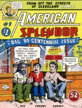
In my opinion, because WWII and the Holocaust combine to be the most important even of the 20th century, it kind of overshadows everything else.  The evil of Hitler, genocide--these are huge topics.  So, yes, huge historical events are important but what about personal experiences?  They have to count for something, too.  I have mentioned Art Spiegelman before in my posts, and I have also mentioned Harvey Pekar. When Harvey Pekar was diagnosed with cancer, he and his wife decided to document their experience in Our Cancer Year.  It is worth checking out.  You also have works like Mom's Cancer (2006).  And you even have works like I Kill Giants, which deals with how children deal with adult situations.  There are plenty of other graphic novels that deal with childhood trauma, medical conditions, divorce, death, and they are all serious topics being discussed through text, dialog, and art through the sophisticated yet accessible medium of sequential art.  I encourage you to Google the subject, find a second-hand copy of one the works mentioned, and see what you think.

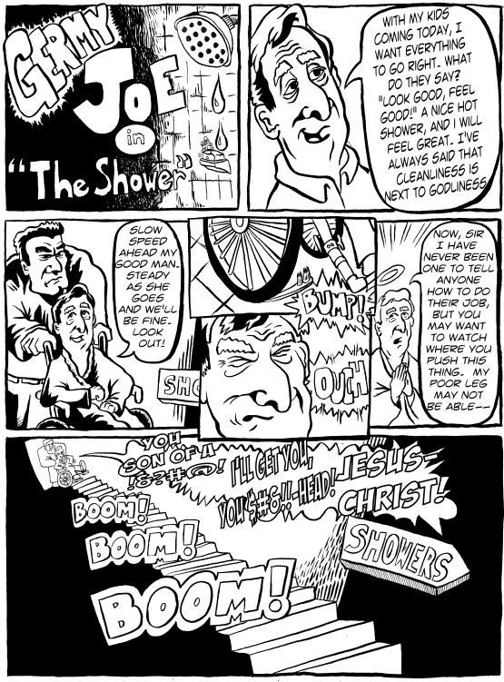
The piece below I did for my grandfather (now deceased).  He spent many, many days and weeks and months in hospitals.  He survived the Depression, WWII, multiple forms of cancer and medical mistakes, he had part of his lung taken out, and he had a fake hip, femur, and knee.  He complained all the time, but he was tough and quick with a joke, too.  At a family event, he was looking at my arms, and commenting on how hairy they are (and remembering the fact that I was over 2 weeks late being born), he said, "You know, if you would have stayed in the womb any longer, you would have come out a dog." And of course he said this while holding my arm and flashing a grin to the rest of the family.  He was a ham.  And he was also a born storyteller.  So, as a tribute to him, and to get him to laugh, I gave my grandfather this comic.  It is filled with many inside family jokes and it is a retelling/exaggeration of story he told the family about getting a shower at the nursing home, which of course was an exaggerated story to begin with, so there is some great double-exaggeration going on here.  Things to keep in mind: my grandfather was famous for saying "Jesus Christ!" and the phrase "Do you think I just fell off the back of the turnip truck?", which he would embellish with more colorful language.  And one of his family nicknames was "Germy Joe," due to the fact that he would instill germaphobia in his family by telling horrific stories of diseases and disasters caused by things like not washing your fruit.
The piece below is different.  I am the king of beginning projects and letting them languish and then remain unfinished.  I love to come up with good ideas and then let them linger as undeveloped ideas that go nowhere.  When I actually complete a project, from start to finish, you know that I was very powerfully motivated.  So, this piece has no dialog, no captions, it was meant for one purpose: for my dad to get better.  That didn't happen, but this blog, and the art projects that I have completed would not have happened if not for the piece pictured below.
This piece is not without its faults.  But I considered it done, complete, exactly as I wanted it.  It was drawn in pencil, inked in with marker, and colored with marker.  The yellow I believe was done in highlighter.  It was supposed to be part scientific illustration (the inset depicting white blood cells attacking and eliminating cancerous cells), and part fable, good vs. evil.  It hung on my dad's hospital room wall as a visual image to focus on and keep his mind on recovery.

So, focusing on the big historical events is very good.  We have to remember the horrible things that happen on the global scale, but for every huge world-altering event, there are a million smaller events affecting people of all ages and backgrounds across the world.  And heartbreak, or divorce, or the loss of a loved one is just as serious as international historical events, and serious comics cannot be summed up with Art Spiegelman's Maus just as comics as a genre of art and publishing cannot be summed up with X-Men or Spider-Man.  Personal pain and trauma can be expressed through image, text, song, and countless other forms, and no genre or artform should be kept from being considered as a valid outlet of those emotions and experiences.

Tuesday, March 1, 2011

A Simple One Panel Cartoon (Or Is It A Comic?)

Comics Vs. Cartoons again.  Theoretically, Comics as form is "sequential art."  More than one panel.  Time passes, even if it is just a moment, between those panels.  So, time moves, there is transition, movement in the sense of movement through time.  We have comic strips like Superman, Peanuts, and Shoe all on the funny pages of our newspapers.  We have comic books like Superman again, X-Men, Spider-Man, Rasl (have to plug Jeff Smith's Rasl).  Comics do not need to have words or dialog but there is a presumption of sequence, i.e., sequential art.

And then we have Cartoons.  Cartoons can mean the animated cartoons of Bugs Bunny, Tom & Jerry, Duck Tales (personal childhood favorite), or Bob's Burgers (currently loving that show, by the way).  But it can also mean a one-panel illustrated piece of art, perhaps with a caption or thought/speech balloon.  Think political cartoons, this time on the opinion page of our newspapers.

But what about The Far Side?  One-panel, sometimes with dialog, sometimes with a caption, but it's a comic strip, right? Or a comic.  Or is it a cartoon?  What about the below?

Not my finest work I will grant you, but it fits in with my discussion with myself.  One panel, not multiple panels, but there are two speech balloons.  Does the presence of two speech balloons or dialog of any kind imply movement through time?  Does that make it sequential art despite there being only one panel?  I don't know.  I did this piece with pen and brush on the left hand side and brush only on the right. This was done to give the left hand subject a more detailed, gritty look.  Brown as a color is gritty like dirt.  The reddish-orange color used on the left is an earth tone, maybe even a color connoting blushing due to embarrassment? Whereas blue, done in sharper more flowing strokes has literally a "cooler" feel to it: cool blue colors, cool people, cool music notes hovering in the air.  Does the color choice and its change from left to right denote movement in time or space, making it sequential?  I don't know.

It is possible that the whole comics vs. cartoons definition is solidly figured out, and I am just behind the times, but it wouldn't be any fun just writing down a definition, right?

Friday, February 25, 2011

The Devil and Mr. Gandhi

The 12-panel comic I promised.  In a previous post, "Indie Comics: Which Way to Go --> The Devil and Mr. Gandhi (the second direction)", I mentioned how indie comics seem to fall into 2 major categories: "real life" (think the trials and tribulations of a geek) and "archetype and foil" (think the odd couple).  This is definitely the latter.  The whole idea is to come up with crazy situations in which to place these two characters, one bent on causing havoc and hijinks (The Devil, a.k.a. Satan), the other determined to be nice and keep things in order (Mohandas Gandhi).
The Devil and Mr. Gandhi

With regards to the coloring: I decided to go with something a little different than the standard black and white.  You will see this type of monochromatic printing style in indie comics.  It's not actually monochromatic in the strictest sense of the word.  There are the black letters, a yellowish orange color around the speech balloons, as well as at least two tones of orange used for shadow and the background.  Playing with the transparency of a layer painted in one color can get you an interesting effect.  Then you can decide what you want to stand out (in black or white, etc.) or fade into the background.  I added some halftones as well.  It is kind of a cheat in terms of coloring.  If I tried to stick with a cartoon palate of primary colors (which is basic) but then colored in every inch of the comic, it would take a very long time. Then do you do a shadow and highlight of each primary color used?  More time.  This is a quick way of adding color in a short period of time.

With regards to speech balloons: Doing 4 panels across on a standard 11x17 comic page makes the panels taller and skinnier.  For me, this makes it easier to devote a full third (or more) of each panel for a speech balloon.  Sometimes I just draw a drawing in a box and add the text below like a caption, other times I try to squeeze in a speech balloon and sometimes hide some of the original drawing.  Here, I hand drew the speech balloons into the drawing and then inked them over.  It gives it a more "hand-drawn" look, and for me, I see it as a matter of practice makes perfect.  I think having the balloons bust out of the panel boxes, and overlap with some of the character elements (like Satan's horns in panel 11), it adds more simple foreground-background depth.

You might also notice some swerving in the panel lines of this piece.  I usually decide on one of two ways to do this: either use a French curve stencil to do curves, and a ruler to draw the lines, or do it all freehand.  this was done freehand, which kind of makes the Photoshopped vector text a cop-out, but I don't care.  Freehand lettering so that it fits and looks good is hard as hell.  As you can see with both coloring and lettering I look for shortcuts.

Sunday, February 20, 2011

How Often Does Talia Shire Come Up in Conversation?

How Often Does Talia Shire Come Up in Conversation?

For me, quite often, and I can't tell how you how amusing I find it.  If you don't know who Talia Shire is, she was in two of the greatest movies ever made: Rocky (Adrian) and The Godfather (Connie).  I am not arguing that she is some kind of brilliant actress who deserves some kind of lifetime achievement award, but she is a solid actress who has been in two awesome movies, and I rarely hear her name mentioned in film conversations.

This first very short comic depicts a conversation that never actually took place at Jose Pistola's in Philly. It was only afterwards that I realized that Talia Shire was what connected the movie conversation we had, which centered on Rocky and The Godfather.

And it happened again.  This time, Talia's name was spoken aloud (at The Good Dog in Philly), and it felt good having her recognized for her place in cinematic history.
I think in some ways, Talia Shire is my litmus test for discussing movies.  If you can give Talia the props she deserves, you're okay with me.

Wednesday, February 16, 2011

Day in the Life (Art Store Encounter)

I know these drawings/comics aren't detailed works of art, but you have to understand that it is a moral victory for myself over myself that I have made two short comics in 2 nights.  Victory!  It gives me hope that I am not as lazy as I think.  This is another piece of autobiography.  This is a close approximation of something that happened to me today at Dick Blick in Philly.

Questions:  1) You seem to feature yourself in your comics a lot.  Are you a vain man?  No. 2) You showed yourself picking your nose in yesterday's comic and today you are on the toilet.  Why are you showing these odd images of yourself?  We all die, we all shit, we all pick our noses.  Why not show a piece of humanity that links all of us together?  And the fact of the matter is: I do have an LL Bean catalog in my bathroom and I do glance through it whilst doing that which I do do whilst there. 3) Is that really what the young lady's tattoo looks like?  No.  I do not have a photographic memory, so I had to improvise.

Tuesday, February 15, 2011

Committing Errant Thoughts to Paper / Another Dinosaur Entry

When something pops into your brain, it is best to put it on paper.  This can be tough.  Do you do thumbnail sketches? Do you make it into a larger project or do you push through and try to finish it as a kind of one-off one-night project?  It takes persistence, patience, and sometimes a commitment to make it a finished work with blemishes.  In other words, get it done, get it on paper, get it posted on the web, and get moving on another project.  No dilly-dallying, no saving it for another time.  If it's not perfect, who cares?  As long as you put forth effort, and publish it.  Put it out there. Thus...

I did this with pencil and inked over with a nib pen, with some text and text boxes added on the computer.  Using a brush would have 1) taken too long to finish and 2) probably would have been much more effort.  Am I lazy?  Sure, of course, but I also wanted to get it done, and move on.  So, with ink-stained hands, I waited for the ink on the paper to dry.  I didn't want to scan it too soon.  Never would I ever want to dirty my Epson GT-15000.

I am still learning the art of laying out a page and laying out a panel in such a way that there is composition to the artwork but also room for speech balloons and text boxes and/or room for other narrative text to be added in.  I definitely think in text and pictures when I am planning out a strip, but it is difficult to account for additional text.  It is a skill I have not yet mastered.  I feel like I also had to come to a decision as to whether the strip would be in B&W or color and if I would do any halftone effects as layers.  I went with "simple is best" and figured I would do a simple line drawing, no shadowing, no layers, no halftones.  Just what I drew with text added.

Some things to note: Is there nose-picking featured in this 8 panel comic strip?  Yes.  What are the circles / dots on the nose in panel 5?  They are large pores on my nose.  I am self conscious about the pores on my nose.  Did the dinosaurs really become extinct because of one erupting volcano? Yes, and you heard it here first. Why is the final panel bigger than the preceding panels?  Great question!  You know how TV sitcoms have a final closing joke?  Or how a Shakespearean sonnet has the final two lines as a rhyming couplet (g, g)?  I think comic strips can have that same punchline or closing or statement at the end, and having the final panel look different has some meaning to it.  I do the same thing in my The Devil and Gandhi comic.  In my moments of determination and inspiration (read: insanity), I think of doing 1 comic or cartoon a day.  Which I think I could do if I stick to simplistic drawings, or scan in pencil and forget about inking or draw in pen and forget about pencil, but I rarely do that.  I guess we will see what shows up tomorrow night.

Thursday, February 10, 2011

Creating a Baby Bib

About 3 or 4 babies ago (not mine, mind you), I began sending custom bibs from CafePress to newborn babies of friends and family.  I started off with two basic designs: a blue color themed bear for boys, and a pink themed hippo for girls.  The animals are easy to draw in a cartoon fashion but also both bears and hippos are hungry or "hungy" animals, so I think it works.

So, I figure I would make a secondary design, this for a baby brother.  I decided to go with the bear theme again, but I am thinking a more babyish bear this time as this is a baby bear brother with the name Brian, so the alliterative quality should work to my advantage as well.

So, first I started off with some thumbnail pencil sketches.  Thumnail sketches should be small and quickly done with as many variations as you can think of.  Get ideas down on paper.  When you work small, proportions tend to come easier.  You don't have to worry about details.  They should be quick, short, sweet sketches as a way to sort through ideas and directions.  They don't even have to be complete.  It is literally brain-storming on paper.  Instead of just a bear face, I wanted to add a prop of some kind to do with eating.  Bowl? Spoon?, messy food?  I also thought it would cute to have the bear wearing cartoon bear footie pajamas.  Of course, this would require a full body profile, so maybe not.  I thought also of doing more of a book illustration watercolor, but then I remembered that I am not Beatrix Potter, and I didn't want to wait until the kid was 3 before he got his bib.

I went with a more finished take on the baby bear in a high chair, and it would up looking similar to the first bear design, which I thought was fine.  I think it should be easily recognizable as baby bear cub, and it has a setup: the spoons, the bowl, and the high chair.  This baby bear is ready to eat.  I purposefully made his bowl empty and the baby bear looking up to his mommy or daddy, like "where the F is my food?" The hearts symbolize LOVE, as in bears love to eat manflesh, but they sometimes have to settle for porridge.  So, here is the finished non-reproducing blue colored pencil sketch.  And the very minor alterations as a black sumi ink sketch.

Colored, and text added, and submitted.  I went with a slightly reddish-brown hue for the bear's fur so I could still do a brown spoon.  Here is what the CafePress delivered product should look like.
CafePress is sometimes awesome, sometimes disappointing, but it's the thought that counts.  Maybe when I have a full-fledged studio running with a team of eager interns ready to do one-off custom silk screen jobs, then I can do some personal quality control.

Monday, January 31, 2011

Why We Like Elephants (The totally random post)


Totally random question: Why are elephants attractive from an artistic standpoint?  Certainly there are more exciting animals in the animal kingdom.  Is there something going on here in our collective consciousness?  They are certainly exotic and literally "stand out" in real life as well as cultural depictions.  We are exposed to elephants from an early age (at least I was).  We see elephants at the circus as children, we see them in Tarzan movies and Disney's Dumbo.
They make really loud noise with their trunks.  As kids we can imitate the elephant trunk with our arm.  We see elephants in episodes of Bugs Bunny and Tom and Jerry and most other cartoons.  Elephants are smart and wise, they never forget, and apparently they are afraid of mice (or least that is what cartoons teach us).  We also see mammoths and elephants in cave art and religious art, so there is permeation of the elephant in human history and human artistic expression (this is starting to sound like bullshit, even to me).

Ganesh
Anyway, here is a more realistic idea about what makes elephants attractive to draw.  They are big, exaggerated animals, so they are very forgiving, especially when drawing a caricature or comic or cartoon.  Elephants have big hulking bodies, long trunks, and big ears.  Their signature pieces of anatomy are easily made with simple geometric shapes.  Instead, think of drawing a tiger or lion.  The feline form has many more intricate and specific aspects in terms of anatomy.  The feline face looks a certain way.  The shape and form of felines have a certain aspect of movement about them even when they are sitting still.  How do you effectively capture that?  Lions and tigers have wonderful muscle tone under flowing furred skin.  Watch the shoulder blades of a female lion stalking its prey.  Beautiful.  But back to elephants.  Again, elephants are much easier to put down on paper.  Large torso, four thick legs, trunk, ears, tail.  Draw some wrinkles and you're done.  They are also not like other animals.  If you were to draw a woodchuck, a beaver, and a prairie dog sitting around a table playing poker, how do you know which animal is which?  Okay, maybe you give the beaver buck teeth, but otherwise there are many rodent-like small mammals that look enough alike.  Draw a vole having lunch with a chipmunk.  I dare you.

Here is another Bruce Blitz YouTube video.  Pay attention to the simple shapes he uses to draw the mammoth.  Look at how exaggerated the trunk and tusks are.  We still immediately recognize the animal.   I also think it is kind of cool that this clip, along with the one I have included on this blog where Bruce draws an dinosaur, have connections to natural history and museums.  I am a firm believer in reinforcing academic factual education with fun art projects.


And not to be outdone, this elephant does self-portraits?  This is kind of freaky.

Saturday, January 22, 2011

Writing (and Drawing) Identity and Autobiography

Anyone who writes stories or novels knows that when you write a character, it is and is not yourself you are putting down on paper.  All writing (even fantasy sci-fi) is autobiographical, but it doesn't mean that there is a direct analog between the author and the character.  So, does it matter whether the author writes the protagonist as "him/herself"?  Can an artist or author inhabit another person or persona effectively when writing a story?  My answer is, of course.  That is a stupid question.

Literary history is fraught with stories of authors hiding their identities for good reason.  Women were taken more seriously (or considered at all) when they published anonymously or with the name of a man (See Currer Bell and George Eliot).  So, what is the motivation?  To get published?  To circumvent a patriarchal bias in the publishing industry?  Does it matter?  Do we discount these women's characterization of men?  No, we do not.

Flaubert once said/write, "Madame Bovary, c'est moi."  Love or hate Madame Bovary, she is one of the most recognizable female characters in history.  We debate forever whether Flaubert does women justice in his characterization, but we do not doubt Bovary's existence (as a fictional character).  She is real.  The story is real, despite its being fictional.  So, what happens when you draw a character in a comic book?  Marjane Satrapi's Persepolis is autobiography.  I am sure there is some poetic license at work, but we are meant to believe that these things drawn on paper happened to character drawn and that that character drawn is Satrapi (or at least a fictional character of herself that is very close to the real Satrapi).  In a work like Maus by Art Spiegelman, although the atrocities of Holocaust were real, the characters are depicted as mice and cats.  Why?  Is it to provide a buffer, a way to approach the horribleness of the reality from a unreal lens?  To make a short leap to non-comics Cubist art, do we not understand or comprehend the horribleness of war any less when depicted in Picasso's Guernica?  Of course not.
Guernica by Pablo Picasso
As is evidenced in this blog, I am fan of the work of Adrian Tomine.  In his Wikipedia entry, there is the following paragraph:
"Most of Tomine's early works rarely mentioned racial issues and most of his characters appeared to be Caucasian. Tomine, who is Asian American, drew himself in many of his early strips, but did not make his ethnicity clear (he often drew his glasses as being opaque, so his eyes couldn't be seen). In later works, he has explored racial issues more directly, such as in his latest graphic novel Shortcomings."  --Wikipedia entry for Adrian Tomine
I have heard a similar argument in print and/or in an interview, but I cannot seem to find that reference.  But in essence, Tomine has been criticized for writing "outside his ethnicity?"  Not sure.  It is a bizarre critique for someone to say, "Hey, you're Asian, shouldn't your characters be Asian?"  And how do you know?  Do all part-Asian peoples look outwardly Asian?  What about people of Jewish decent? How do you tell an Italian from a Jew or Arab for that matter drawn in a comic book?  Or any other race or ethnicity?  And how does this argument translate to to writing through/about another gender or sexual orientation or social status?  Does Kazuo Ishiguro's Asian heritage prevent him producing The Remains of the Day, a work dripping with Britishness?  Again, of course not.  I won't get into the arguments for an against identity politics, I just know that people are too uptight, and that part of why I quit a Ph.D. program was that classmates said really stupid things that clearly showed that they never experienced the creative process of ever in their lives, because if they did, they wouldn't have said the stupid and ignorant things they did.

In the brief comic below (done a couple years ago), the author/artist (Me) makes a cameo appearance but is not the primary character(s) in the comic, right?  Maybe. Maybe not. What are the implications of writing from a different gender or sexual orientation?  I don't think there are any, and there need not be any sub-text or hidden message in the choice.  I can only speak for myself, but in my dreams I take on multiple perspectives and points of view, irrespective of age, gender, or existence.  Haven't you ever dreamt of and dreamt from the perspective of someone or something that in real life you know to be fictional?  When you "think" what exactly are you doing other than talking with yourself?  I find that my most heartfelt dialog comes from 1) real life dialog with other people and 2) dialog with myself.  Does writing/drawing a gender or ethnicity provide distance from the character and if so, is it a way of "hiding" behind a character?  No.  When the words of thoughts of a writer ring true, it does not matter in what form the thoughts and ideas manifest themselves.  Read a sci-fi novel and try to discount the insightful philosophical discourse of purple aliens or androids.  Can't be done.  Kill not the messenger.

I include the YouTube clip below, because 1) It's a funny example of a fictional character explaining writing across gender lines, and 2) Julie Benz is in it. I love you, Darla!

Monday, January 17, 2011

Indie Comics: Which Way to Go --> The Devil and Mr. Gandhi (the second direction)

File:American Splendor no 1.jpgIndie Comics: Which Way to Go?

I think are two major directions you can take with regards to comics, particularly indie comics.  And by indie comics, I mean non-superhero comics, not published by Marvel or DC or even Dark Horse.  Think 8.5x11" paper folded in half, stapled. The first direction is "real life" or something like it.  Personal stories, characters based on real life people (exaggerated, of course), but overall a commitment to depicting the boring, awkward, painful day-to-day realities of life.  Being dumped by a significant other, awkward sexual misadventures, painful life experiences, and death (social and literal) all make for the typical indie comic.  They can even have an important cultural-historical bent to them as well: think Satrapi's Persepolis, a personal account of coming of age during the Iranian revolution.   Sure, exciting, wonderful, happy things in life happen, too, but you don't get mad or sad or frustrated (read: contemplative) about the great things in your life.  When you're happy, the endorphins kick in and you don't really think of stewing on what just happened. When you think of the first direction, you can't help but think of people like Harvey Pekar. His American Splendor is one of the most recognizable examples of the classic indie comic, in part because the art of R. Crumb. If you have a chance to watch the movie, American Splendor (see the link), you get to see the truly bizarre overlapping of Paul Giamatti playing Harvey Pekar.  It is part documentary, part dramatic re-enactment.


If I had to choose a more modern, up-to-date form of the autobiographical, indie comic form, I would pick Adrian Tomine's Optic Nerve comic, collected in 32 Stories.  I mention this particular work, because I want to do another post in which I examine Tomine's art in comparison to other kinds of comic art, and in 32 Stories you get to see Tomine's progression in his art skills, which is fascinating.


The second direction is "archetype and foil", which usually means there is an underlying concept that provides the means to write dialog and throw the characters into situations.  Think Laurel and Hardy, Abbott and Costello, and more importantly Bill Watterson's Calvin and Hobbes.  Calvin and Hobbes is not an indie comic, but I think it makes for a good transition into my own attempt at the archetype and foil comic genre.  When you have a pre-existing character type, you can place that character in a situation in which he/she will have plenty to talk about.  The foil character then is a sounding board for archetype.  It's not as clear-cut as I am making it out.  I am simplifying to make a point.  Call it a "straight man" or a sidekick, but you need someone to set up the joke and another person to land it.

My attempt at the archetype and foil genre is The Devil and Mr. Gandhi. The Devil (or Satan, or a dozen other names) as a character has a pre-existing history and mythology.  We all know what the Devil should look and sound like.  He is the bad guy, the trickster character, the deceiver, the tempter.  And he is probably pretty fun. Mohandas K. Gandhi, on the other hand, was a champion of non-violent protest, civil rights, and humanity in general.  He wore glasses and home-spun cloth.  He was highly educated.  He was a nerd.  So, of course, you put these two people together and things will happen.

The scene depicted below is actually loosely based on real-life events.  I actually went to a movie theater where I asked for salt, and the greasy, shitball kid working there wanted to charge me $1.50 for salt.  And not even real salt, some gross, disgusting, butter and salt-flavored salt alternative (it was orange).  And I did imagine torturing the punk.