Monday, January 31, 2011

Why We Like Elephants (The totally random post)


Totally random question: Why are elephants attractive from an artistic standpoint?  Certainly there are more exciting animals in the animal kingdom.  Is there something going on here in our collective consciousness?  They are certainly exotic and literally "stand out" in real life as well as cultural depictions.  We are exposed to elephants from an early age (at least I was).  We see elephants at the circus as children, we see them in Tarzan movies and Disney's Dumbo.
They make really loud noise with their trunks.  As kids we can imitate the elephant trunk with our arm.  We see elephants in episodes of Bugs Bunny and Tom and Jerry and most other cartoons.  Elephants are smart and wise, they never forget, and apparently they are afraid of mice (or least that is what cartoons teach us).  We also see mammoths and elephants in cave art and religious art, so there is permeation of the elephant in human history and human artistic expression (this is starting to sound like bullshit, even to me).

Ganesh
Anyway, here is a more realistic idea about what makes elephants attractive to draw.  They are big, exaggerated animals, so they are very forgiving, especially when drawing a caricature or comic or cartoon.  Elephants have big hulking bodies, long trunks, and big ears.  Their signature pieces of anatomy are easily made with simple geometric shapes.  Instead, think of drawing a tiger or lion.  The feline form has many more intricate and specific aspects in terms of anatomy.  The feline face looks a certain way.  The shape and form of felines have a certain aspect of movement about them even when they are sitting still.  How do you effectively capture that?  Lions and tigers have wonderful muscle tone under flowing furred skin.  Watch the shoulder blades of a female lion stalking its prey.  Beautiful.  But back to elephants.  Again, elephants are much easier to put down on paper.  Large torso, four thick legs, trunk, ears, tail.  Draw some wrinkles and you're done.  They are also not like other animals.  If you were to draw a woodchuck, a beaver, and a prairie dog sitting around a table playing poker, how do you know which animal is which?  Okay, maybe you give the beaver buck teeth, but otherwise there are many rodent-like small mammals that look enough alike.  Draw a vole having lunch with a chipmunk.  I dare you.

Here is another Bruce Blitz YouTube video.  Pay attention to the simple shapes he uses to draw the mammoth.  Look at how exaggerated the trunk and tusks are.  We still immediately recognize the animal.   I also think it is kind of cool that this clip, along with the one I have included on this blog where Bruce draws an dinosaur, have connections to natural history and museums.  I am a firm believer in reinforcing academic factual education with fun art projects.


And not to be outdone, this elephant does self-portraits?  This is kind of freaky.

Friday, January 28, 2011

Creepy Attic and Bear (My Process Explained)

The drawing here is one of the illustrations I did for the book project entitled The Groan Folks.  It's kind of a spooky interpretation of childhood fears and grown-up worries.  My brother did the text (poems) and I did the illustrations.  This work is done in pencil.  My process is this: I take an 14" x 17" sheet of bristol board (usually Strathmore brand) from a pad, and I measure out a rough 10" x 13" box in pencil.  I then go back and forth in a cross-hatching fashion with a plain white colored pencil.  I will call this a form of "priming." I cannot say that  this dramatically helps with blending, but I do it anyway.  It would be interesting to do an un-primed illustration and then a primed one, see what differences (if any) arise.

Anyway, once, I have it primed, I get to work laying out the rough illustration with a HB or or even a 2H pencil. Once I have the major forms sketched out, I start deciding what areas will have the most shading and the least.  This is an imprecise method.  I don't plan out exactly what areas will be finished with an 8B pencil.  And sometimes it helps to start shading in gradually.  Certain areas can be "lightened" by heavily shading in surrounding areas.  I will sometimes change my mind as to what will be the most heavily shadowed area.

Below is a closer look at the eaves. In this you can see how going from left to right there are more pencil lines on white paper, and the more right you go, there is more blending.  Also, one-direction pencil lines get turned into multiple-direction cross-hatching as you go right, and there is some straight up 8B pencil blackness in the rafters.

The attic is definitely based on my own attic growing up, but it is not an observational drawing.  I did not go up to my attic and draw it.  There is no gaping hole in my attic wall, there is actually a creepy little door.  However, I have been in my attic so many times and in the small cubby hole there that I know it by heart.  I think I would rather have the "feel" of the attic rather than the actual attic.  I am definitely influenced by Edward Gorey, so I definitely tend to add shadow and texture with many (many, many!) short strokes of a pencil.  In the rafters you can see that I have gone from cross-hatching to straight up blended blacks in pencil the farther you go back into the cubby hole.  I also tried to play with some shadows inside the cubby hole.

In addition to the faint lines on white, blended grays and blacks, I would try to shadows beneath white, like the kind of drop shadows on the pieces of wallpaper hanging off the wall.

Some of the technical things.  Vanishing point and depth:  I definitely used a vanishing point in this illustration (well off the upper right of the piece).  So in the rafters you can see that the lines are not parallel, they will connect at some point. It is a very old trick to create the illusion of depth.  Think of drawing railroad tracks growing closer as they reach the horizon.  See the Wikpedia entry on vanishing point.  A more sophisticated approach would use 2 vanishing points, but I am not bery sophisticated. Weight and balance: The exposed brick I drew (which is the the wall with its wallpaper removed) almost bisects the drawing vertically.  You can use bigger shapes and separations in a drawing to create a sense of balance (or imbalance if you want).  Here is an odd tip: bisecting a piece of art with a line through the center will not necessarily create balance.  It is not just about lines, it's about white space and black space.  A great trick if you are an artist is to look at work upside down.  It's sounds silly and simple but it works.  You see less of the subject matter when you do this.  Things becomes abstracted and you tend to see the shape, weight, and balance of the piece.  Leading the eye: And if you trace over many of the lines in this illustration and then add in the arrow on the side of the cardboard box, there is definitely a design that leads the eye of the viewer to the bear in the box.  I cannot say honestly that this was all planned.  Sometimes it just works out that way.  I almost want the reader to look at two things: the bear, and the deep recess of the attic eaves.  Or maybe be looking at the rafters out of the corner of your eye, because who knows what is in that creepy space.

I f you want to see some weird, creepy illustrations, Edward Gorey is certainly a good choice.  Chris Van Allsburg (who did Jumanji) is also worth looking into if you want to see some incredibly executed pencil illustration.  I would love to hear recommendations for other fine pencil illustrated books.  Please comment.

Saturday, January 22, 2011

Writing (and Drawing) Identity and Autobiography

Anyone who writes stories or novels knows that when you write a character, it is and is not yourself you are putting down on paper.  All writing (even fantasy sci-fi) is autobiographical, but it doesn't mean that there is a direct analog between the author and the character.  So, does it matter whether the author writes the protagonist as "him/herself"?  Can an artist or author inhabit another person or persona effectively when writing a story?  My answer is, of course.  That is a stupid question.

Literary history is fraught with stories of authors hiding their identities for good reason.  Women were taken more seriously (or considered at all) when they published anonymously or with the name of a man (See Currer Bell and George Eliot).  So, what is the motivation?  To get published?  To circumvent a patriarchal bias in the publishing industry?  Does it matter?  Do we discount these women's characterization of men?  No, we do not.

Flaubert once said/write, "Madame Bovary, c'est moi."  Love or hate Madame Bovary, she is one of the most recognizable female characters in history.  We debate forever whether Flaubert does women justice in his characterization, but we do not doubt Bovary's existence (as a fictional character).  She is real.  The story is real, despite its being fictional.  So, what happens when you draw a character in a comic book?  Marjane Satrapi's Persepolis is autobiography.  I am sure there is some poetic license at work, but we are meant to believe that these things drawn on paper happened to character drawn and that that character drawn is Satrapi (or at least a fictional character of herself that is very close to the real Satrapi).  In a work like Maus by Art Spiegelman, although the atrocities of Holocaust were real, the characters are depicted as mice and cats.  Why?  Is it to provide a buffer, a way to approach the horribleness of the reality from a unreal lens?  To make a short leap to non-comics Cubist art, do we not understand or comprehend the horribleness of war any less when depicted in Picasso's Guernica?  Of course not.
Guernica by Pablo Picasso
As is evidenced in this blog, I am fan of the work of Adrian Tomine.  In his Wikipedia entry, there is the following paragraph:
"Most of Tomine's early works rarely mentioned racial issues and most of his characters appeared to be Caucasian. Tomine, who is Asian American, drew himself in many of his early strips, but did not make his ethnicity clear (he often drew his glasses as being opaque, so his eyes couldn't be seen). In later works, he has explored racial issues more directly, such as in his latest graphic novel Shortcomings."  --Wikipedia entry for Adrian Tomine
I have heard a similar argument in print and/or in an interview, but I cannot seem to find that reference.  But in essence, Tomine has been criticized for writing "outside his ethnicity?"  Not sure.  It is a bizarre critique for someone to say, "Hey, you're Asian, shouldn't your characters be Asian?"  And how do you know?  Do all part-Asian peoples look outwardly Asian?  What about people of Jewish decent? How do you tell an Italian from a Jew or Arab for that matter drawn in a comic book?  Or any other race or ethnicity?  And how does this argument translate to to writing through/about another gender or sexual orientation or social status?  Does Kazuo Ishiguro's Asian heritage prevent him producing The Remains of the Day, a work dripping with Britishness?  Again, of course not.  I won't get into the arguments for an against identity politics, I just know that people are too uptight, and that part of why I quit a Ph.D. program was that classmates said really stupid things that clearly showed that they never experienced the creative process of ever in their lives, because if they did, they wouldn't have said the stupid and ignorant things they did.

In the brief comic below (done a couple years ago), the author/artist (Me) makes a cameo appearance but is not the primary character(s) in the comic, right?  Maybe. Maybe not. What are the implications of writing from a different gender or sexual orientation?  I don't think there are any, and there need not be any sub-text or hidden message in the choice.  I can only speak for myself, but in my dreams I take on multiple perspectives and points of view, irrespective of age, gender, or existence.  Haven't you ever dreamt of and dreamt from the perspective of someone or something that in real life you know to be fictional?  When you "think" what exactly are you doing other than talking with yourself?  I find that my most heartfelt dialog comes from 1) real life dialog with other people and 2) dialog with myself.  Does writing/drawing a gender or ethnicity provide distance from the character and if so, is it a way of "hiding" behind a character?  No.  When the words of thoughts of a writer ring true, it does not matter in what form the thoughts and ideas manifest themselves.  Read a sci-fi novel and try to discount the insightful philosophical discourse of purple aliens or androids.  Can't be done.  Kill not the messenger.

I include the YouTube clip below, because 1) It's a funny example of a fictional character explaining writing across gender lines, and 2) Julie Benz is in it. I love you, Darla!

Wednesday, January 19, 2011

Happy Birthday, Paul Cézanne!


From the Wikipedia entry on Paul Cézanne:

Paul Cézanne (French pronunciation: [pɔl seˈzan]; 19 January 1839 – 22 October 1906) was a French artist and Post-Impressionist painter whose work laid the foundations of the transition from the 19th century conception of artistic endeavor to a new and radically different world of art in the 20th century. Cézanne can be said to form the bridge between late 19th century Impressionism and the early 20th century's new line of artistic enquiry, Cubism. The line attributed to both Matisse and Picasso that Cézanne "is the father of us all" cannot be easily dismissed.
Part of the purpose of this blog is to promote important, influential artists and art museums.  I grew up going to the Philadelphia Art Museum.  Perhaps you've seen the museum steps in the movie Rocky.  It has the look and feel of the Acropolis in Greece.  For me, it was a place where on Sunday mornings you could take an army of children (siblings and cousins) and get in for free if you agreed to get out before 2pm (I think).  And you could give young people a chance to see important works of art up close.  It remains to this day one of my favorite places to go.


Photo by Nfutvol
 If you go the the Art Museum website, you can creat "My Gallery" and collect works that the museum has.  It is pretty neat in that you can see what the museum has to offer, but also the pages on the individual works have interesting information and some of them have audio clips from the tours that you can listen to. It will tell you if the piece of art is on display or not and if it is, it will even tell you in which gallery it is located.  Essentially, you can host and/or promote a virtual tour.  Pretty cool.  Here is a link to my collection of Cézanne paintings.  And here is a screen shot of what the My Gallery feature looks like.  You will most likely see other My Gallery links here on The Ink Puddle Art Blog.


Tuesday, January 18, 2011

Coloring a Comic Book Page

If you do anything with comic books, you have probably been to Newsarama.  I am pretty pissed off at them right now, so they are not even getting a URL link.  They have the video below embedded on their site, but I am embedding straight from YouTube.  Why am I pissed?  I originally wanted to show the video of Jim Lee using the iPad to do a sketch of Wonder Woman, showing how the iPad can be used as a creative art tool.  Of course, it helps to be an awesome artist like Jim Lee, but anyway.  So, you can find the title of the intro with the video link through Newsarama's website, but the link is dead.  You can search Google, and again, dead.  If you look at the cached version through Google, you get teased with the image and video link, but again, dead.

But I digress.  Below is an awesome and informative video showing how Tony Avina, a professional comic colorist, colors a page. 

We can't all have a team of colorists laying down prep work for us, or have superfast computers with super expensive software, but there are options out there for the budget-minded digital artist.  That will have to be my next post: free or low cost graphic software.

Monday, January 17, 2011

Indie Comics: Which Way to Go --> The Devil and Mr. Gandhi (the second direction)

File:American Splendor no 1.jpgIndie Comics: Which Way to Go?

I think are two major directions you can take with regards to comics, particularly indie comics.  And by indie comics, I mean non-superhero comics, not published by Marvel or DC or even Dark Horse.  Think 8.5x11" paper folded in half, stapled. The first direction is "real life" or something like it.  Personal stories, characters based on real life people (exaggerated, of course), but overall a commitment to depicting the boring, awkward, painful day-to-day realities of life.  Being dumped by a significant other, awkward sexual misadventures, painful life experiences, and death (social and literal) all make for the typical indie comic.  They can even have an important cultural-historical bent to them as well: think Satrapi's Persepolis, a personal account of coming of age during the Iranian revolution.   Sure, exciting, wonderful, happy things in life happen, too, but you don't get mad or sad or frustrated (read: contemplative) about the great things in your life.  When you're happy, the endorphins kick in and you don't really think of stewing on what just happened. When you think of the first direction, you can't help but think of people like
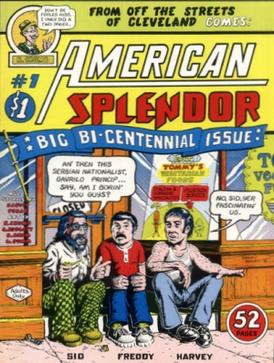
 Harvey Pekar. His American Splendor is one of the most recognizable examples of the classic indie comic, in part because the art of R. Crumb. If you have a chance to watch the movie, American Splendor (see the link), you get to see the truly bizarre overlapping of Paul Giamatti playing Harvey Pekar.  It is part documentary, part dramatic re-enactment.


If I had to choose a more modern, up-to-date form of the autobiographical, indie comic form, I would pick Adrian Tomine's Optic Nerve comic, collected in 32 Stories.  I mention this particular work, because I want to do another post in which I examine Tomine's art in comparison to other kinds of comic art, and in 32 Stories you get to see Tomine's progression in his art skills, which is fascinating.


The second direction is "archetype and foil", which usually means there is an underlying concept that provides the means to write dialog and throw the characters into situations.  Think Laurel and Hardy, Abbott and Costello, and more importantly Bill Watterson's Calvin and Hobbes.  Calvin and Hobbes is not an indie comic, but I think it makes for a good transition into my own attempt at the archetype and foil comic genre.  When you have a pre-existing character type, you can place that character in a situation in which he/she will have plenty to talk about.  The foil character then is a sounding board for archetype.  It's not as clear-cut as I am making it out.  I am simplifying to make a point.  Call it a "straight man" or a sidekick, but you need someone to set up the joke and another person to land it.

My attempt at the archetype and foil genre is The Devil and Mr. Gandhi. The Devil (or Satan, or a dozen other names) as a character has a pre-existing history and mythology.  We all know what the Devil should look and sound like.  He is the bad guy, the trickster character, the deceiver, the tempter.  And he is probably pretty fun. Mohandas K. Gandhi, on the other hand, was a champion of non-violent protest, civil rights, and humanity in general.  He wore glasses and home-spun cloth.  He was highly educated.  He was a nerd.  So, of course, you put these two people together and things will happen.

The scene depicted below is actually loosely based on real-life events.  I actually went to a movie theater where I asked for salt, and the greasy, shitball kid working there wanted to charge me $1.50 for salt.  And not even real salt, some gross, disgusting, butter and salt-flavored salt alternative (it was orange).  And I did imagine torturing the punk.

Friday, January 14, 2011

Bruce Blitz Cartooning TV Show

I remember watching lots of Public Television as a kid.  There seemed to be more to learn from TV back in the 80's.  You had Sesame Street, and Mister Rogers of course.  And I loved, and I mean loved Reading Rainbow.  But I also remember watching the Frugal Gourmet (before the Food Network existed and before his whole sex scandal thing), and I also remember more than a couple art shows, namely The Joy of Painting with Bob Ross and Cartooning with Bruce Blitz.  Enjoy this YouTube clip.

These were not great shows, but they were really cool when you were a kid, and all you had to do was pick up a marker and some paper.  You could learn something about lines, and shape, and composition and finishing a piece of art in pretty easy steps.  I guess you can get all this online these days, but with all the crap on TV these days, I think there should be room for more art instruction programs, especially since due to school budget cuts, Art classes and programs are constantly being downsized and cut.  You can still buy Bruce Blitz supplies, including pre-lined cartoon and comic boards.  Since Blitz cartoons a dinosaur, I figure I would include a link to one of the classic children's illustrated books, Syd Hoff's Danny and the Dinosaur.


Be on the look-out for my own How-To segments on drawing, cartooning, and how to fill a fountain pen (this is extremely exciting to me).

Wednesday, January 12, 2011

Looking at Brush (or Needle) Strokes

Photo by Cburnett
I am fairly certain I traveled to Milwaukee, WI in Fall of 2005 to present a paper on Irish literature at the Midwest MLA conference, and while I was there, I had the chance to visit the Milwaukee Art Museum, which is quite nice.  Not only is it a swanky looking art museum (designed by Santiago Calatrava Valls) located right on the waterfront in Milwaukee, but they also happened to be showing a Rembrandt show at the time, which was quite interesting.   What I found to be interesting was that this particular show focused on Rembrandt the draftsman--the show included drawings, sketches, and etchings that he made.  When I think of an artist like Rembrandt, I think of oil paintings like the one featured below.  Very recognizable, you often see this work in art history text books.  You can discuss the painting's and its artist's merits with regards to composition, use of light, rendering of facial expression, and one of the highest beard per capita ratios of any painting of the 17th century--it's all right there. 
The Anatomy Lesson of Dr. Nicolaes Tulp, Rembrandt (1632), oil on canvas
Although I have never seen this painting up close and in person, I imagaine that it is quite "flat" and by that I meant that although the subject matter painted appears to be in three dimensions, the painting itself appears in two dimensions, with no immediately apparent elevation or depth to the paint itself.  Go into your nearest art museum and look at any 17th or 18th century painting and see for yourself.  However, when you look at a Van Gogh painting (for example), you can stand right in front of it and witness individual brush strokes.  In the final layers of paint, you can see that there is just straight up oil paint laid down on the canvas, sometimes in thick globs (if elegant, genius globs).  If you can sneak a poke (wait until the security guard is looking the other way) at the painting you will be able to feel Van Gogh's brush stroke, which is kind of a religious experience.

In contrast, stand up close in front of a Masters' oil painting, and you will more than likely see a flat piece of canvas.  There are so many layers of oil paint and turpentine and linseed oil, all finely blended and layered, and the beauty and artistry lies in the optical illusions of light and depth all within a seemingly flat  two dimensional painting.  Some would argue that the beauty of such paintings lies in the fact that you cannot see the individual brush strokes, that its verisimilitude transcends the subject/object dichotomy and you experience the painting as an extension of your reality.  Of course, that is all academic bullshit, but I digress.


So, let me return to Rembrandt.  When you look at a drawing or sketch, you can see how the artist lays down lines, determines the shape of a subject. Look at Rembrandt's Three Crosses.   


Etchings are made through the intaglio method, meaning that ink is contained just below the surface on a plate, and through the pressure of a printing press the ink is transferred from the plate to the paper.  The artist applies a ground to a plate and then scratches away the ground to reveal metal.  The plate is then dipped into an acid bath and the exposed metal is bitten by the acid, creating an incision in the metal (which holds the ink).  So, when you see an individual line in an etching, you are seeing that artist's hand-drawn line.  Although the line is made usually with a needle (to scrap away the ground), it is the artist's stroke, needle stroke as opposed to brush stroke.  Here is a detail of Three Crosses.

Rembrandt, Three Crosses (Detail)

You can see that poses are reduced to minimal lines here.  Hands are reduced to small, precise lines.  Cross-hatching lines overlap each other in what appears to be swiftly executed short strokes of the needle (not sure if they used etching needles in the 17th century).  The lines are not so free-wheeling as to be called "gestural," but I love this because this is a kind of "sketch" by an incredibly skilled oil painter.  You can see a man (or woman) holding his/her face in hand.  There is grief there.  There is frustration and anger on the face of the man looking skyward, his hands almost grasping his hair.  There is a lot going on in this collection of short, thin lines.

So, why bring this up?  I think that etchings are often overlooked as a way to examine how artists use lines and develops a piece of art.  Unless featured in a specific exhibit, etchings often take a back seat to color paintings.  Forensic art historians will examine brush stroke patterns (pressure, angle, combination of paint with other materials purposefully or accidentally mixed in with the paint) to attribute paintings to artists, but I think there is something to be said for looking at the basic simple lines put on paper, or in the case of an etching, put onto a metal plate with a metal needle.  Every painting begins with an initial sketch or drawing to layout the shapes, and the first drawing or sketch is not necessarily the "foundational" beginning to a piece of work of art, it could be the finished product as seen below.

Matisse etching (left) and Picasso etching (right)
If I had a proper studio, I would do etchings.  I will have to scan in what few examples of my own work I have.  Etching requires chemicals, including acid and space and ventilation to use acid, and a priting press (which are very expensive, and big and heavy).  But I encourage any student of art to look into the drawings and etchings made by your favorite artist who is known for paintings.  Don't be satisfied with looking at paintings on a computer screen.  Although I will say that examining etchings on a computer screen is more acceptable than examining other media.  Since it is black and white and a printed media, you are not missing the depth or texture of paint.  As a last vestige of my graduate education I cannot help but mention Walter Benjamin's "Art in the Age of Mechanical Reproduction."  When you look at a painting online or in a book, it has been re-sized.  You are not experiencing the original piece of art. That is why you get "Detail" looks at particular parts of a painting, so you can see close up and perhaps "Actual size" what the painting looks like.  When you see a hand-pulled etching on paper, those lines are the exact shape and size originally made by the artist.  The plate size, the line size remains identical.  No resizing, and instead of one irreplaceable and singular oil painting, hundreds of etchings can be pulled from one plate before it starts to degrade, so you have more of a chance to see an original etching than an original oil painting in person.  Regardless, make a pilgrimmage to Art, go to a museum, and then form your own opinion.

Monday, January 10, 2011

Making My Twitter Link Image

For a brief week or so I had the horribly unimaginative, cookie-cutter Twitter icon that they give on the Twitter website (see left).  What fun is that?  When you look at other people's alternative Twitter bird images they tend to go for the graphic-design, very slick look.  I figured I would go for a more cartoon look for my own.

I knew I wanted to do this with ink and brush, so I started out with some thumbnail drawings in pencil.  Here is a look (see left).  It seems to me that the only unspoken rule about the Twitter Bird is that he/she/it is blue.  Other than that, who cares what exactly it looks like.  Why not have something original and custom made? I thought about going with the Manga look, perhaps a grainy, sketchy bird.  Although I did not necessarily use left, right, and straight on perspective on purpose, but it helps to see what you are thinking of drawing in different poses.  I even attempted a kind of looking-over-the-should pose.  Should I make it a self-portrait of sorts?  Should my Twitter bird sport glasses?  a beard?  I  settled on cartoon style with glasses and a semblance of a beard and "at work" at an art desk.

I then sketched out the design in non-reproducing blue colored pencil on bristol board.  The image here showing the blue sketch is exaggerated.  The actual drawing is on pure white bristol board and the blue lines are quite light, but for it to show up well in the scanning process and in an image you have to play with the light/contrast/saturation settings.

Also, one thing I have learned working with pencil on bristol is that you really have to go over the blue pencil lines with a kneaded rubber eraser.  If you leave any more than a very thin layer of colored pencil, the ink tends to resist taking to the bristol board.  It almost runs off the pencil marks, which is not good.  You have to go over it several times or it smudges or puddles, which can cause some issues.  I then inked over the blue lines with sumi ink on brush (see Tools Used below for details).  Since the lines are light enough, you can make adjustments on the fly with a brush.  In fact, it is very difficult to exactly and precisely trace over lines with a brush full of ink.  You should always allow yourself to make adjustments and give yourself some liberty and leave some room in the drawing to mess up a little in case you have to fix it with ink.  Then it is a waiting game.  Sumi ink dries pretty fast, though. A quick run through the scanner, and I could play around with color.

I did not want to over-produce this drawing.  I wanted it to be as cartoony as possible and show the brush work and not have the focus be on any computer produced effects. To the left you can see the scanned in black & white drawing.  In Paint Shop Pro, I add color.  I cannot help but do a standard cartoon color scheme.  Stick with as few colors as possible and then do a "rule of three" shading effect highlight/midtone/shadow.  I actually don't do any highlights with this image, just a color and shadow color.

And on the right hand side at the top of the screen is the finished image, my Twitter image.

Tools Used: HB pencil, non-reproducing blue colored pencil, gum eraser, sumi ink, #0 Raphael Kolinsky sable brush.

Friday, January 7, 2011

Making a Poster

Proletariat Drinker
In 2009, my brother and I became involved with the Pour-A-Palooza Beer Festival hosted by The Pour House in Westmont, NJ through our beer blog The Ferment Nation.  For this event, I wound up creating a poster that served as supplementary advertising for the event (see left).  It's pretty easy to see that I was going for a Soviet propaganda poster effect, a little bit Proletarian, and little bit the beer-drinking Everyman.  Although I do not have a very good website to recommend if you look for Google Images of Soviet posters, propaganda posters, Stalin or Lenin posters, etc., you will see my inspiration.  There is obviously something sinister about these posters, not only because of the regimes they supported but also because they are so naked and stark in their "instruction" to the audience/viewer.  Of course, they are also very bold and striking, and mesmerizing in a way.  The man is in a heroic pose, holding up his beer like a war trophy or a banner.  I used heavy-handed black and blocky shadowing and bold lettering, with some backwards "R" thrown in for good measure to give it a Soviet feel.  Primary colors and half-tone effects through the computer gave it a look of a mass produced lithograph (I hoped).  I really like have overlapping and slightly off-kilter layers with the halftone effect to give the digital creation more of a hand pulled piece of art effect.  A funny story: the manager of the Pour House was accosted by a confused drinker who thought the poster was an endorsement of President Obama and his "Socialist agenda" (and this was in New Jersey).

J. Howard Miller's "We Can Do It!"
So, in 2010, I did not want to do the same thing, but I thought I might keep with the wartime propaganda theme.  J. Howard Miller's poster "We Can Do It!" provided the inspiration.  I felt that co-opting a feminist icon and the WWII war effort to further the drinking of beer was totally legitimate.  I basically took the basic pose of the women in Miller's poster and modified it.  I tried to combine Miller's strong woman with a WWII bomber plan "nose art" pin-up girl (think of the movie Memphis Belle).  She had to be a woman who could lure you into a bar and then drink you under the table.

I started off with a pencil drawing, using basic HB and 2B pencils.  After getting a rough sketch, I refined it, again using pencils.  My first intention was to ink in the drawing like comic art, but to be honest, if you are not feeling confident with your brush strokes on a piece of art that you are trying to finish and publish in time for an event, you go with your strengths, in this case, pencils.  So, with a 4B pencil (if I remember correctly) I laid down some solid and final lines.  Using the threshold settings in Paint Shop Pro, I scanned the pencil drawing as black and white line art.  This would give me the best chance to layer and then color the art.

The second step here was adding color and although I try to stick to very bold and primary colors when dealing with posters, I finally went with more effects: layering of colors and the halftone effect to make the color palette less cartoonish.  What I like to do is have the black and white raster layer be the background and then create another layer with the white removed, kind of like a plastic overlay in a cartoon animation cel.  Then I start adding color layers and then using the halftone effect with varying sized circles and keeping a transparent background, so you can have a dark blue halftone patch over top of a lighter blue background.  You can see from the final piece here that the poster is largely a piece of graphic design.  The outline of the We Can Brew It! woman is the only hand-drawn portion of the poster.  The rest is achieved through various vector and raster layers in PSP.  The same could be said for the Proletariat Drinker from the first poster shown in this post.  Only the man and his beer are hand-drawn and scanned.  the sunburst effect, the stars, and obviously the text were all added via computer.

Tools Used: HB, 2B, 4B pencil, scanner, Paint Shop Pro.

Tuesday, January 4, 2011

Oil Pastels

I bought a pack of inexpensive student grade oil pastels from L'Arte Art Shop in Haddonfield, NJ.  Just a whim, really.  The entire pack was less than $10, and I had never used them before.  I know I don't particularly like chalk pastels.  Oil pastels at least offer some bold colors and you can use turpentine to thin the pastels out, so I gave it a shot.  I supplemented this pack with some extra Van Gogh brand oil pastels from Dick Blick in Philly.

I figured I would start off with something simple and not from perspective.  Went with a flower to see what I could do with layering and blending.  In my initial experiments, you can blend with a blending stick, but often you simply "push" the colors around, which is fine.  If you have ever used the "push" brush in Paint Shop Pro or Photoshop, you will know that you can come up with some pretty interesting effects.  You can actually pick up a pretty inexpensive set of clay sculpting tools to help you with pushing, and scraping and shaping the oil pastels.

Blending with turpentine: I tried using a blending stick and actually dipping it into a bottle of turpentine.  This got a little smelly (toxic fumes, FYI), and I had to place the toxic blending stick into a sealable plastic baggie.  This didn't seem like the best option. I then started to use turpentine on a paint brush. This was better, because you had more precise control and you could "brush" the color in a brush stroke, somewhat mimicking oil paints.  Obviously, depending on the shape and size of the brush, it will give you a different blending effect.

Scraping/Cutting:  Another effect you can use would be to cut away color or scrape it away.  This is interesting because it depends on how you are blending.  If you used white pastel underneath and then added on different colors and blended them, then when you scrape away, you will see the white of the paper or board you are using (or other color, etc.).  If you were heavily using turpentine and blending the colors together, you will not necessarily get a crisp original paper color underneath.  This could be good or bad.  You can use the scraped away color (white) as a pure white highlight, but also you can add white pastel to the already color blended paper.  It depends on what effect you want.  In my experience, white pastel added as a highlight will make it look more like oil paints.  When scraping away color to reveal white, it appears to me to resemble more woodcut or linoleum cut art.

In the flower example, you can see where I can scraped away color to make the vein pattern on both the flower petals as well as the leaf.  You cannot get that kind of detail work "adding on" white pastel as a highlight, whereas with an X-Acto knife, you can cut and scrape very fine details, carving it out of the oil pastel.

With the self-portrait, I definitely went with more of the oil paint simulation.  I basically, applied the pastels, blended, applied more pastels, blended again (liberal amounts of turpentine).  Added shadow and highlights using dark and light colored pastels.

I would love to hear any suggestions and/or techniques I can try.