 For a brief week or so I had the horribly unimaginative, cookie-cutter Twitter icon that they give on the Twitter website (see left). What fun is that? When you look at other people's alternative Twitter bird images they tend to go for the graphic-design, very slick look. I figured I would go for a more cartoon look for my own.
I knew I wanted to do this with ink and brush, so I started out with some thumbnail drawings in pencil. Here is a look (see left). It seems to me that the only unspoken rule about the Twitter Bird is that he/she/it is blue. Other than that, who cares what exactly it looks like. Why not have something original and custom made? I thought about going with the Manga look, perhaps a grainy, sketchy bird. Although I did not necessarily use left, right, and straight on perspective on purpose, but it helps to see what you are thinking of drawing in different poses. I even attempted a kind of looking-over-the-should pose. Should I make it a self-portrait of sorts? Should my Twitter bird sport glasses? a beard? I settled on cartoon style with glasses and a semblance of a beard and "at work" at an art desk.
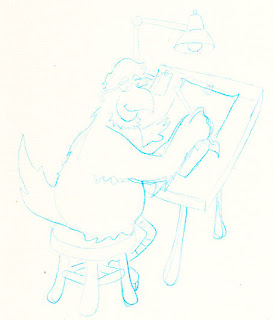
I then sketched out the design in non-reproducing blue colored pencil on bristol board. The image here showing the blue sketch is exaggerated. The actual drawing is on pure white bristol board and the blue lines are quite light, but for it to show up well in the scanning process and in an image you have to play with the light/contrast/saturation settings.
 Also, one thing I have learned working with pencil on bristol is that you really have to go over the blue pencil lines with a kneaded rubber eraser. If you leave any more than a very thin layer of colored pencil, the ink tends to resist taking to the bristol board. It almost runs off the pencil marks, which is not good. You have to go over it several times or it smudges or puddles, which can cause some issues. I then inked over the blue lines with sumi ink on brush (see Tools Used below for details). Since the lines are light enough, you can make adjustments on the fly with a brush. In fact, it is very difficult to exactly and precisely trace over lines with a brush full of ink. You should always allow yourself to make adjustments and give yourself some liberty and leave some room in the drawing to mess up a little in case you have to fix it with ink. Then it is a waiting game. Sumi ink dries pretty fast, though. A quick run through the scanner, and I could play around with color.
I did not want to over-produce this drawing. I wanted it to be as cartoony as possible and show the brush work and not have the focus be on any computer produced effects. To the left you can see the scanned in black & white drawing. In Paint Shop Pro, I add color. I cannot help but do a standard cartoon color scheme. Stick with as few colors as possible and then do a "rule of three" shading effect highlight/midtone/shadow. I actually don't do any highlights with this image, just a color and shadow color.
And on the right hand side at the top of the screen is the finished image, my Twitter image.
Tools Used: HB pencil, non-reproducing blue colored pencil, gum eraser, sumi ink, #0 Raphael Kolinsky sable brush.


No comments:
Post a Comment
Note: Only a member of this blog may post a comment.