From The Met Website:"In conjunction with the exhibition Byzantium and Islam: Age of Transition (on view March 14 through July 8, 2012), art historian Elizabeth Bolman introduces the Red Monastery project."

Showing posts with label Art History. Show all posts
Showing posts with label Art History. Show all posts
Thursday, March 29, 2012
The Red Monastery (Video from The Met)
Thanks again to The Met for having great art videos you can embed.
Tuesday, November 1, 2011
My Requisite (Belated) Halloween Post: Frankenstein in Un-Living Color
Actually, not in color at all, because I want to focus on the black & white illustrated adaptations of Mary Shelley's Frankenstein. Three 20th-century artists have done visually stunning illustrations for this gothic masterpiece: Lynd Ward, Barry Moser, and Bernie Wrightson, and it made me think what might be behind the use of black and white.

Black and white imagery can be wonderfully jarring with high contrast, bold imagery. A skilled artist can use just black and white, positive and negative space to create tension, convey emotion, and make a statement. Some of the best known and most respected photography from the 20th century is in black and white. So, I would say that people with knowledge of art would never accuse black and white being a hindrance to artistic expression. However, I believe that there persists an incorrect notion that older (from the past 100 years all the way back to antiquity) works of art (books, fine art, film, photography, etc.) utilized black and white for a specific effect exclusively. In other words, if an artist had full living color at his or her disposal, he or she would still choose black and white. We know that ancient Egyptian statues were not plain sand colored statues, they were colored in bright hues using a variety of inks and pigments and even real gold. It wasn't just the sarcophagi that were beautifully rendered in color, most everything was, and it is just because of time and sand storms that everything above ground has lost most of its color. Same thing goes for Rome. We think of Rome as cold white marble, but Rome was all about vibrant color paintings and mosaics. We also know that early printed books would have plates colored by hand, and that the presence of black and white versus color is more of a class distinction. You had to pay more to have the black and white plates hand colored.

So, enough about people's assumptions about antiquity, let's jump ahead to the 20th century. In the 1920's and 1930's moviegoers were being thrilled by horror classics like The Phantom of the Opera, Dracula, and Frankenstein. Evil characters lurking in the "dark" of night, lightning crashing overhead in a dark sky, revealing monsters. Moonlight turns color into shades of gray. Despite our living world being in color and the celluloid film being in black and white, these movies were scary. Other movies like Jane Eyre (1943) and Rebecca (1940) added to the ouevre of Gothic novels adapted into black and white film. But I think that if these filmmakers had color at their disposal, then they would have used it. Right now we are dealing with 3-D taking over. Brian Selznick's book The Invention of Hugo Cabret is illustrated in black and white, but Martin Scorsese is embracing color and 3-D in his latest film, Hugo, an adaptation of that book. I attended a Brian Selznick book event and he loves the new movie and totally stands by Scorsese's use of color and 3-D.

So, does that meant that illustrators and publishers are trapped in the past? I don't think so. For one, we could look again to economics. When you publish a book in color, do you print the color illustrations on paper, on glossy paper, on a plate? They all have varying prices associated with each process. But i think it is undeniable that black and white illustrations of Gothic works like Frankenstein tap into the collective memories of viewers of black and white Gothic films more so than fans of the original printed text. I think most people who have seen the original Frankenstein movie may be confused and somewhat bored by Mary Shelley's novel. It is not a terribly exciting novel. And keep in mind the proximity of movie and book. I think if you watch the 1931 film Frankenstein you will appreciate its wonderful use of shape and shadow. The original Frankenstein movie first appeared in 1931, Lynd Ward's illustrated edition was published in 1934, and then Bride of Frankenstein appeared in 1935. So, combine the printing simplicity of black ink on white paper, and the popularity of a visually stunning film in black and white, and you can understand why Lynd Ward's illustrations make for a perfect fit.
So, what we have here is a very rich culture of skilled artisans who could work very well with black and white. Frank D. Hall (Art Director for many of Universal's most memorable monster movies), Alfred Hitchcock (Director of Rebecca, Alfred Hitchcock Presents, and later in color, The Birds), Lynd Ward, who specialized in black and white woodcut prints. There are critics who put down the movie Frankenstein because of its condensation and departure from the original source text, but there are also critics who would put down illustrators like Bernie Wrightson for being merely a comics artist.
I don't think I am writing anything new here, and I apologize for rambling on. Any film buff would probably say that of course Gothic movies and the black and white horror filmmakers influenced illustrators and comics artists. This post is mostly an excuse to feature the works of Ward, Wrightson, and Moser, and wish everyone a Happy Halloween. As someone who works extensively in pencil and black ink, I think comic book artists don't get the recognition they deserve, and classic black and white films suffer from a similar lack of appreciation. So, cheers to black and white imagery, and film, and all things Gothic and Horror! Happy Halloween!
Black and white imagery can be wonderfully jarring with high contrast, bold imagery. A skilled artist can use just black and white, positive and negative space to create tension, convey emotion, and make a statement. Some of the best known and most respected photography from the 20th century is in black and white. So, I would say that people with knowledge of art would never accuse black and white being a hindrance to artistic expression. However, I believe that there persists an incorrect notion that older (from the past 100 years all the way back to antiquity) works of art (books, fine art, film, photography, etc.) utilized black and white for a specific effect exclusively. In other words, if an artist had full living color at his or her disposal, he or she would still choose black and white. We know that ancient Egyptian statues were not plain sand colored statues, they were colored in bright hues using a variety of inks and pigments and even real gold. It wasn't just the sarcophagi that were beautifully rendered in color, most everything was, and it is just because of time and sand storms that everything above ground has lost most of its color. Same thing goes for Rome. We think of Rome as cold white marble, but Rome was all about vibrant color paintings and mosaics. We also know that early printed books would have plates colored by hand, and that the presence of black and white versus color is more of a class distinction. You had to pay more to have the black and white plates hand colored.
So, enough about people's assumptions about antiquity, let's jump ahead to the 20th century. In the 1920's and 1930's moviegoers were being thrilled by horror classics like The Phantom of the Opera, Dracula, and Frankenstein. Evil characters lurking in the "dark" of night, lightning crashing overhead in a dark sky, revealing monsters. Moonlight turns color into shades of gray. Despite our living world being in color and the celluloid film being in black and white, these movies were scary. Other movies like Jane Eyre (1943) and Rebecca (1940) added to the ouevre of Gothic novels adapted into black and white film. But I think that if these filmmakers had color at their disposal, then they would have used it. Right now we are dealing with 3-D taking over. Brian Selznick's book The Invention of Hugo Cabret is illustrated in black and white, but Martin Scorsese is embracing color and 3-D in his latest film, Hugo, an adaptation of that book. I attended a Brian Selznick book event and he loves the new movie and totally stands by Scorsese's use of color and 3-D.
So, does that meant that illustrators and publishers are trapped in the past? I don't think so. For one, we could look again to economics. When you publish a book in color, do you print the color illustrations on paper, on glossy paper, on a plate? They all have varying prices associated with each process. But i think it is undeniable that black and white illustrations of Gothic works like Frankenstein tap into the collective memories of viewers of black and white Gothic films more so than fans of the original printed text. I think most people who have seen the original Frankenstein movie may be confused and somewhat bored by Mary Shelley's novel. It is not a terribly exciting novel. And keep in mind the proximity of movie and book. I think if you watch the 1931 film Frankenstein you will appreciate its wonderful use of shape and shadow. The original Frankenstein movie first appeared in 1931, Lynd Ward's illustrated edition was published in 1934, and then Bride of Frankenstein appeared in 1935. So, combine the printing simplicity of black ink on white paper, and the popularity of a visually stunning film in black and white, and you can understand why Lynd Ward's illustrations make for a perfect fit.
So, what we have here is a very rich culture of skilled artisans who could work very well with black and white. Frank D. Hall (Art Director for many of Universal's most memorable monster movies), Alfred Hitchcock (Director of Rebecca, Alfred Hitchcock Presents, and later in color, The Birds), Lynd Ward, who specialized in black and white woodcut prints. There are critics who put down the movie Frankenstein because of its condensation and departure from the original source text, but there are also critics who would put down illustrators like Bernie Wrightson for being merely a comics artist.
I don't think I am writing anything new here, and I apologize for rambling on. Any film buff would probably say that of course Gothic movies and the black and white horror filmmakers influenced illustrators and comics artists. This post is mostly an excuse to feature the works of Ward, Wrightson, and Moser, and wish everyone a Happy Halloween. As someone who works extensively in pencil and black ink, I think comic book artists don't get the recognition they deserve, and classic black and white films suffer from a similar lack of appreciation. So, cheers to black and white imagery, and film, and all things Gothic and Horror! Happy Halloween!
Wednesday, January 12, 2011
Looking at Brush (or Needle) Strokes
 |
| Photo by Cburnett |
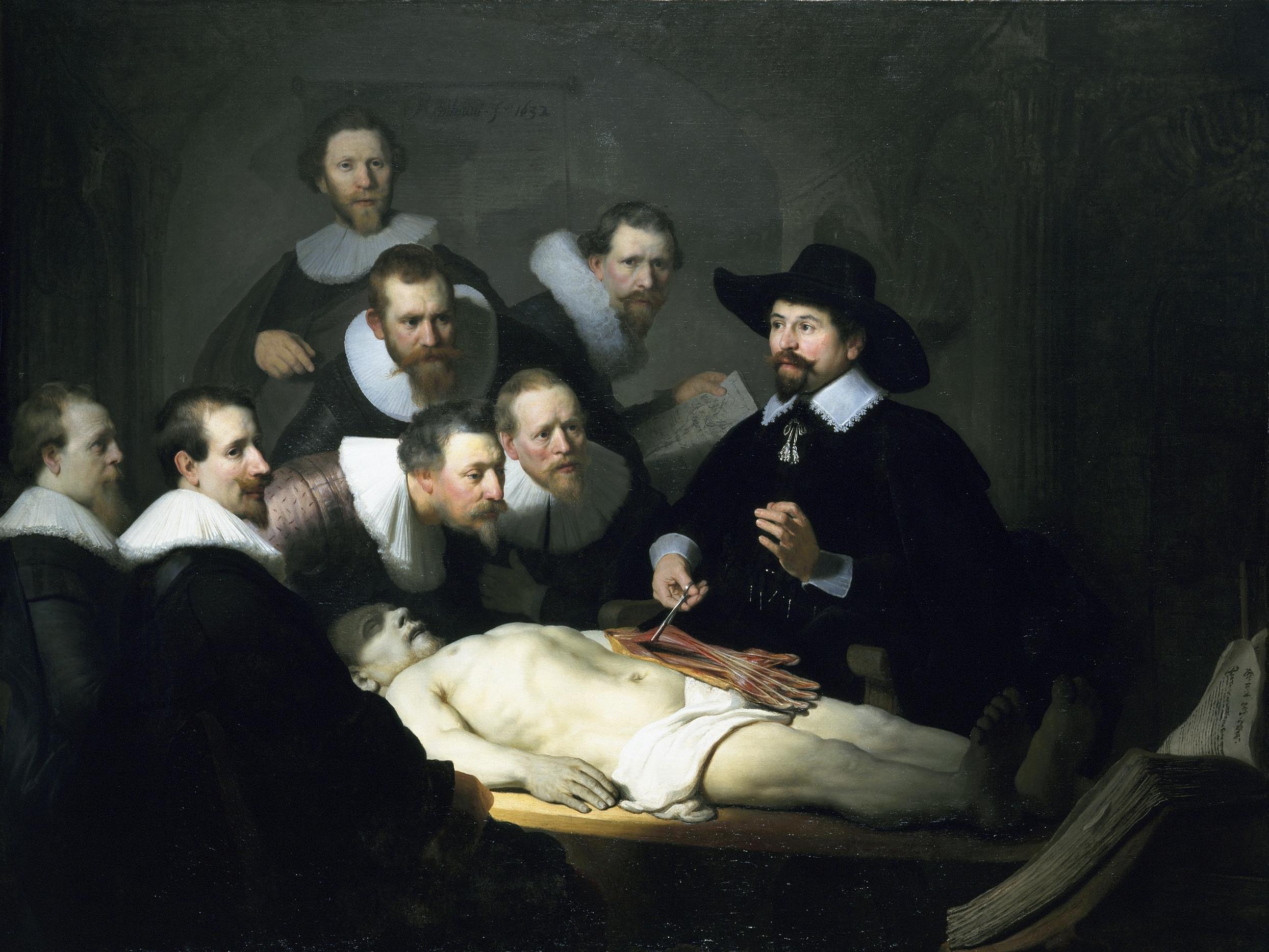 |
| The Anatomy Lesson of Dr. Nicolaes Tulp, Rembrandt (1632), oil on canvas |
Although I have never seen this painting up close and in person, I imagaine that it is quite "flat" and by that I meant that although the subject matter painted appears to be in three dimensions, the painting itself appears in two dimensions, with no immediately apparent elevation or depth to the paint itself. Go into your nearest art museum and look at any 17th or 18th century painting and see for yourself. However, when you look at a Van Gogh painting (for example), you can stand right in front of it and witness individual brush strokes. In the final layers of paint, you can see that there is just straight up oil paint laid down on the canvas, sometimes in thick globs (if elegant, genius globs). If you can sneak a poke (wait until the security guard is looking the other way) at the painting you will be able to feel Van Gogh's brush stroke, which is kind of a religious experience.
In contrast, stand up close in front of a Masters' oil painting, and you will more than likely see a flat piece of canvas. There are so many layers of oil paint and turpentine and linseed oil, all finely blended and layered, and the beauty and artistry lies in the optical illusions of light and depth all within a seemingly flat two dimensional painting. Some would argue that the beauty of such paintings lies in the fact that you cannot see the individual brush strokes, that its verisimilitude transcends the subject/object dichotomy and you experience the painting as an extension of your reality. Of course, that is all academic bullshit, but I digress.
So, let me return to Rembrandt. When you look at a drawing or sketch, you can see how the artist lays down lines, determines the shape of a subject. Look at Rembrandt's Three Crosses.

Etchings are made through the intaglio method, meaning that ink is contained just below the surface on a plate, and through the pressure of a printing press the ink is transferred from the plate to the paper. The artist applies a ground to a plate and then scratches away the ground to reveal metal. The plate is then dipped into an acid bath and the exposed metal is bitten by the acid, creating an incision in the metal (which holds the ink). So, when you see an individual line in an etching, you are seeing that artist's hand-drawn line. Although the line is made usually with a needle (to scrap away the ground), it is the artist's stroke, needle stroke as opposed to brush stroke. Here is a detail of Three Crosses.
You can see that poses are reduced to minimal lines here. Hands are reduced to small, precise lines. Cross-hatching lines overlap each other in what appears to be swiftly executed short strokes of the needle (not sure if they used etching needles in the 17th century). The lines are not so free-wheeling as to be called "gestural," but I love this because this is a kind of "sketch" by an incredibly skilled oil painter. You can see a man (or woman) holding his/her face in hand. There is grief there. There is frustration and anger on the face of the man looking skyward, his hands almost grasping his hair. There is a lot going on in this collection of short, thin lines.
So, why bring this up? I think that etchings are often overlooked as a way to examine how artists use lines and develops a piece of art. Unless featured in a specific exhibit, etchings often take a back seat to color paintings. Forensic art historians will examine brush stroke patterns (pressure, angle, combination of paint with other materials purposefully or accidentally mixed in with the paint) to attribute paintings to artists, but I think there is something to be said for looking at the basic simple lines put on paper, or in the case of an etching, put onto a metal plate with a metal needle. Every painting begins with an initial sketch or drawing to layout the shapes, and the first drawing or sketch is not necessarily the "foundational" beginning to a piece of work of art, it could be the finished product as seen below.
If I had a proper studio, I would do etchings. I will have to scan in what few examples of my own work I have. Etching requires chemicals, including acid and space and ventilation to use acid, and a priting press (which are very expensive, and big and heavy). But I encourage any student of art to look into the drawings and etchings made by your favorite artist who is known for paintings. Don't be satisfied with looking at paintings on a computer screen. Although I will say that examining etchings on a computer screen is more acceptable than examining other media. Since it is black and white and a printed media, you are not missing the depth or texture of paint. As a last vestige of my graduate education I cannot help but mention Walter Benjamin's "Art in the Age of Mechanical Reproduction." When you look at a painting online or in a book, it has been re-sized. You are not experiencing the original piece of art. That is why you get "Detail" looks at particular parts of a painting, so you can see close up and perhaps "Actual size" what the painting looks like. When you see a hand-pulled etching on paper, those lines are the exact shape and size originally made by the artist. The plate size, the line size remains identical. No resizing, and instead of one irreplaceable and singular oil painting, hundreds of etchings can be pulled from one plate before it starts to degrade, so you have more of a chance to see an original etching than an original oil painting in person. Regardless, make a pilgrimmage to Art, go to a museum, and then form your own opinion.
In contrast, stand up close in front of a Masters' oil painting, and you will more than likely see a flat piece of canvas. There are so many layers of oil paint and turpentine and linseed oil, all finely blended and layered, and the beauty and artistry lies in the optical illusions of light and depth all within a seemingly flat two dimensional painting. Some would argue that the beauty of such paintings lies in the fact that you cannot see the individual brush strokes, that its verisimilitude transcends the subject/object dichotomy and you experience the painting as an extension of your reality. Of course, that is all academic bullshit, but I digress.
So, let me return to Rembrandt. When you look at a drawing or sketch, you can see how the artist lays down lines, determines the shape of a subject. Look at Rembrandt's Three Crosses.

Etchings are made through the intaglio method, meaning that ink is contained just below the surface on a plate, and through the pressure of a printing press the ink is transferred from the plate to the paper. The artist applies a ground to a plate and then scratches away the ground to reveal metal. The plate is then dipped into an acid bath and the exposed metal is bitten by the acid, creating an incision in the metal (which holds the ink). So, when you see an individual line in an etching, you are seeing that artist's hand-drawn line. Although the line is made usually with a needle (to scrap away the ground), it is the artist's stroke, needle stroke as opposed to brush stroke. Here is a detail of Three Crosses.
 |
| Rembrandt, Three Crosses (Detail) |
You can see that poses are reduced to minimal lines here. Hands are reduced to small, precise lines. Cross-hatching lines overlap each other in what appears to be swiftly executed short strokes of the needle (not sure if they used etching needles in the 17th century). The lines are not so free-wheeling as to be called "gestural," but I love this because this is a kind of "sketch" by an incredibly skilled oil painter. You can see a man (or woman) holding his/her face in hand. There is grief there. There is frustration and anger on the face of the man looking skyward, his hands almost grasping his hair. There is a lot going on in this collection of short, thin lines.
So, why bring this up? I think that etchings are often overlooked as a way to examine how artists use lines and develops a piece of art. Unless featured in a specific exhibit, etchings often take a back seat to color paintings. Forensic art historians will examine brush stroke patterns (pressure, angle, combination of paint with other materials purposefully or accidentally mixed in with the paint) to attribute paintings to artists, but I think there is something to be said for looking at the basic simple lines put on paper, or in the case of an etching, put onto a metal plate with a metal needle. Every painting begins with an initial sketch or drawing to layout the shapes, and the first drawing or sketch is not necessarily the "foundational" beginning to a piece of work of art, it could be the finished product as seen below.
 |
| Matisse etching (left) and Picasso etching (right) |
Subscribe to:
Posts (Atom)