

Tuesday, May 17, 2011
The Case of the Super Secret Blog
All the black line work done entirely using sumi ink on a Raphael brand kolinsky sable brush #0. Text added with Paint Shop Pro along with some very scant gray shadow. It has become a personal goal of mine to have something that makes each and every panel stand out. I still have not reached that level yet. I think if you draw a close-up of a person, then the person should be expressing some emotion. Eyes, eyebrows, mouth: you should be able to read something going on there, like a silent film. Or, you should have movement of some kind. I kind of cheat by adding movement "lines." Like I said, a work in progress. Or, you should have text obviously or some kind of more-polished composition--this would make sense when doing a full-page spread or a page wide panel instead of 3 panels across. So, I will strive for one of those things being represented in each and every panel, either 1) Emotion OR 2) Viewable movement or action (kicking, punching would be good) OR 3) a finely drawn composition. We'll see how this challenge works out. I feel like I already strive for this, but it is easy for an okay idea have a decent thumbnail storyboard and then fall completely flat in the final product.
Progress: I kind of free-styles panel number 8: I only had very little pencils on it at all. I would say 90% of panel 8 was done on the fly using the brush and ink and seeing where it would take me. And, I did not feel compelled to use Wite-Out once on this piece, and my hands were relatively ink-free at the end of the night, which is a huge improvement.
Reading about Creating Art
I have been re-reading Chaim Potok's My Name is Asher Lev. I have already come across some great quotes that I have tweeted on Twitter. The first one was this: "I grew up encrusted with led and spectrumed with crayons. My dearest companions were Eberhard and Crayola. Washing for meals was a cosmic enterprise" (Potok 6). We all have our favorite art supplies that we used as a kid. I still have a penchant for Dixon Ticonderoga pencils, something about the green and yellow color scheme. At the moment, I will choose the Staedtler Mars Lumograph pencils (blue with a black end) over most any. Are they any better? I am honestly not sure, but I like the way they look and how I can pick out my 2B's and 4B's quickly. I don't like it when the softness is printed on the barrel of the pencil.

Potok also writes,
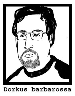
I also tend to use visual markers. For myself, it's my glasses, my beard, and a swoop to my hair. Certainly my body type and my typical wearing of either a button down shirt or a T-Shirt come into play, too. For other people, I do the same, I take inventory of the visual markers. It could be something they wear (glasses, clothing, etc.) or a hairstyle, or an exaggerated physical feature. Sometimes I can capture an expression or a singular moment or a genuine likeness, but I am fine with "representing" someone with a caricature or a readable set of codes. ITEM #1 (GLASSES) + SPECIFIC HAIRSTYLE = PERSON X. I also liken it to how William Wordsworth characterizes poetry: "the spontaneous overflow of powerful feelings: it takes its origin from emotion recollected in tranquility." Emotion recollected in tranquility in artistic form can be quite different than the immediate sketching of a subject. When I am drawing someone from real life, it can be quite frenetic, eyes darting back and forth, pencil moving back and forth, trying to capture that moment, that likeness. Erasing, more drawing, more erasing, blending, fine tuning. Drawing a cartoon of someone or just a general likeness afterwards with the subject absent is much slower, easier, more deliberate yet relaxed. Neither is a photograph. Which is more accurate?

The way I look at it, even the most famous portrait by the most famous and skilled painter is still a memory impression of the subject. No living subject (read: human being) can sit perfectly still. The light from the sun moves slowly yet constantly on the subject, shifting shadows and highlights. An errant thought running through the mind of the subject can make subtle shifts in his/her emotional state and therefore how they look, how they are perceived, and what they project to the world. Therefore, all portraits, all painting depicting something in real life, is sequential. Light, shadow, the subject, the subject's emotions all change minute by minute and second by second. One portrait captures an enormity of poses and facets of the subject, which culminates in one "impression."


Sources: Potok, Chaim. My Name is Asher Lev. New York: Anchor, 2003.

Potok also writes,
"Inside my room, I lay on my bed with my eyes closed and thought about the man from Russia. I saw his face clearly: the nervous eyes, the beaked nose, the pinched features. That face had lived eleven years in a land of ice and darkness. I could not imagaine what it was like to live in ice and darkness. I put my hands over my eyes. There was his face, very clearly; not truly his face, but the way I felt about his face. I drew his face inside my head. I went to my desk and on a piece of blank white paper drew how I felt about his face" (Potok, 41).I can really relate to this imagery. I have said myself on this very blog that the drawings I make of myself and of other people are not from life studies. First, my family, friends, and co-workers might find me a bit suspicious if I just plopped down next to them with a sketchpad, but also, I think there is something about capturing how you envision someone. I rely heavily on my memory and what I see in my mind's eye. It's not necessarily my POV as I saw it when it happens. I often depict myself and another subject from a third person point of view, sometimes drawing things that I could not possibly have seen.
I also tend to use visual markers. For myself, it's my glasses, my beard, and a swoop to my hair. Certainly my body type and my typical wearing of either a button down shirt or a T-Shirt come into play, too. For other people, I do the same, I take inventory of the visual markers. It could be something they wear (glasses, clothing, etc.) or a hairstyle, or an exaggerated physical feature. Sometimes I can capture an expression or a singular moment or a genuine likeness, but I am fine with "representing" someone with a caricature or a readable set of codes. ITEM #1 (GLASSES) + SPECIFIC HAIRSTYLE = PERSON X.
The way I look at it, even the most famous portrait by the most famous and skilled painter is still a memory impression of the subject. No living subject (read: human being) can sit perfectly still. The light from the sun moves slowly yet constantly on the subject, shifting shadows and highlights. An errant thought running through the mind of the subject can make subtle shifts in his/her emotional state and therefore how they look, how they are perceived, and what they project to the world. Therefore, all portraits, all painting depicting something in real life, is sequential. Light, shadow, the subject, the subject's emotions all change minute by minute and second by second. One portrait captures an enormity of poses and facets of the subject, which culminates in one "impression."
 |
| Pencil and oil pastel on watercolor paper. From life, using a mirror. |
 |
| "Stylized realism" ink drawing done from a photograph. |
 |
| Visual marker-based cartoon depiction of myself (glasses + beard + hair swoop + button down shirt = ME). |
Sources: Potok, Chaim. My Name is Asher Lev. New York: Anchor, 2003.
Monday, May 9, 2011
Springtime in Philly (Part 2)
I will put all 3 pages into one post once it is complete. If you want to read this from the beginning be sure to check out the post below this for page 1.

I took more time thinking about this one, how the panels would be composed. Page 1 was rough and quick, but it also made me think that I should use more of the surface area of the paper. I am liking the additional text boxes above the top row of panels and below the bottom row of panels. It allows me to keep the same dimensions when I am doing thumbnail sketches, but then add additional text. And I am even liking the use of the side gutter of the page for overlapping text boxes, narration, or like I have done twice, now, added a To Be Continued...
Oddly enough, I started off this page using 2 styles of nib pens, one for the finer details, and then one for broader lines and the panel borders and speech balloons, but I wound up using brush and sumi ink to fill in some of the black portions and do some detail work. I used two different brush pens to fill in large segments of black ink: the Tombow dual-tip brush pen and the Pigma brush (makers of Micron pens). I am not fully satisfied with either. I am still on the hunt for the best brush pen for filling in large areas of black on bristol.
I didn't totally intend to include both Star Wars and Star Trek references in this 3 page (not sure if it will get to 4 pages) comic, but I like how they are included. Now that I think of it, maybe I should do an entire comic strip devoted to my watching the "Spock's Brain" episode of Star Trek. Another unintended or unplanned image was the many handed clip-boarder. My initial image was of a clipboard "boxing out" like they teach you in basketball, but when I started drawing the arms, I started to think of Da Vinci's "Vitruvian Man" or a many-armed Hindu god, but then I couldn't come up with anything interesting or funny enough to say. Page 3 is not planned, plotted, sketched or thought-up at all, so it should be fun.
Thursday, May 5, 2011
Springtime in Philly (Part 1)
I rushed this one, but I don't care. I need to do some drawing, so I did. I will clean up page 2, maybe even re-do the whole thing, but if I just wait and keep waiting, it will never get done. I need to do more drawing, inking, scanning, publishing on a nightly basis. It is tough, though.

I was plagued with troubles tonight. I felt rushed but I also felt the need to draw and complete something, even if it wasn't to my total satisfaction. I started off by inking with calligraphy ink on bristol board, which in theory you would think would be fine, but the ink was feathering and it was blotchy, but I didn't notice I was using the wrong ink, so I switched pens and lo! and behold! more of the same feathering. Then I realize I am not using my acrylic ink. Of course, I switch to the correct ink and I start leaving some ink puddles (yes, like the blog's name) on the paper. I had to use wite-out on some spots to make corrections. Then the wite-out on my hands was interfering with how I was holding the pen. Then the hours drag on. I felt like scrapping the whole thing, starting over, using a brush instead of a pen, but that is for another time.
And you have to bear with me that the Sand People reference from Star Wars is leading somewhere. Part 2 will be posted soon enough.
Subscribe to:
Posts (Atom)